Amarok/Proposals/Last FM UI Redesign:2.0


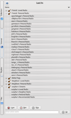
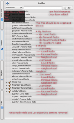
The second image contains all the changes, skip to it if you don't like to read.
- Move the "Play artist radio" text field to the top, above the tree.
- The field is at the bottom of the panel, far out of reach of the cursor and the eye. Ever since we moved the toolbar to the top of the ui, we have been more top centric. This will also fit in better visually with all our other services where there is usually a query/filter field in that position.
- The "Play artist radio" text field should support arbitrary tags and users
- So, add a drop down with those three choices
- Remove the Love/Ban/Skip buttons
- We already have them on the toolbar. I propose removing them.
- Reorganize the content displayed in the tree
- Parent Level: Friends, Neighborhood, My Stations
- Friends and Neighborhood would have the following structure: Friends/Neighborhood -> username -> Personal
- Radio/Neighborhood/Loved Tracks
- My stations would have the following structure: My Stations -> Loved/Neighborhood/Personal/Recommended
- New icons to beef up the eye candy would be sweet
