Amarok/Proposals/IconIdeas
We recently held a contest to pick the new icon for amaroK, Blue Wolf by Da-Flow won. However the story doesn't end there, due to legalities with Warp Graphics, Inc it cant be used, so a new competition will be held to find another icon, here's a list of idea's to hopefully help inspire you to create something brilliant, or if you aren't capable of visual brilliance, come up with a brilliant idea for this page.
Wolf tooth / which is also a horn --Underlord
Same as now, but replace the moon with a CD
The current icon (look up and left) looks good, and goes well with the shiny kde icons. Maybe change it to include an 'A' or 'K' something?
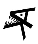
Combination of A and K letters to create a wolf head, example:
Example of A & K forming wolf head
--Underlord
it doesn't really scale. really folks should think of what would look good at 16x16. If it happens to scale up well, thats good, but not as important. --Eean 00:52, 8 Mar 2005 (EST)
a wolf chewing on speaker cables

____________________________________________________________________________________________________________________________________
Why can't we just reuse something else from the previous contest? Personally I like this one a lot (was on k-l.o, but seems to have disappeared from it...), but the second place finisher (one that's going into Nuvola) was very nice as well. --Illissius
Thats a nice icon, but allot of people are sick of the eye/speaker design, i think if there is another competition then alot of people would re-enter their previous submissions. --Underlord
Well, just speaking my personal opinion, I seriously dislike all the wolf icons. I just don't get htf a wolf has anything to do with an audio player, the fact that amarok means wolf in inuit(?) is just a(n unfortunate, because it means we get a bunch of wolf icons I have to endure) coincidence :(. That blue coffeebean-like icon, well, I don't think of it as either an eye (where did the eyes come from, in the first place? visual similarity to a speaker and the resulting confusion?) or a speaker, just something that looks cool. The Nuvola icon, while it could be interpreted as a speaker, is much different from all the previous eye/speaker designs, and it got 2nd place in the contest so people certainly don't hate it, so that's probably the least sucky option... --Illissius
Id agree with the above, forget the wolves! Give us something more modern looking :)
This is the icon ideas page, not the icons unidea page. :P --Eean 00:54, 10 Apr 2005 (EDT)
I tryed to make an icon that had a wolf on it, cause I really liked the old wolf one. icon --GentlemanFinn 09:28, 21 Apr 2005 (EDT)
I guess, you won't know that this is a wolf, if you only see the trayicon :-( --Apachelogger 10:13, 21 Apr 2005 (EDT) This icon is really cool. I like it. It needs some work, and needs to work in the tray and small sizes. Any chance of working on this some more? Mxcl 15:47, 22 Apr 2005 (EDT)
I'm glad you liked it, I made a version that might be easyer to tell what is, if it's seen on the tray here! I am not sure if I'am going to finish it, but if anyone want to finish it or just use some of it here's the svg --GentlemanFinn 14:03, 24 Apr 2005 (EDT)
I'm kind of worried that this one, again, is too close to the Warp Graphics logo... I like it a lot, but this does kind of seem like a simplified version of that image. That said, there's some definite posibilities here, let's see what can be done with this :) --Leinir 15:27, 24 Apr 2005 (EDT)
File:Amarok-icon-1280.png A productive night (Thanks for tossing me the svg Cozy) has resulted in this proposal, and you can see here that it does scale pretty nicely to 22x22 pixels: File:Amarok-icon-22.png. Anyone wants to get this one and work on it further, just grab a hold of me (The wiki won't let me upload the svg to here) --Leinir 21:59, 24 Apr 2005 (EDT)
I'll break out my 10 gallon barrel of whoop-ass on anyone who doesn't think this icon rocks. --Eean 02:42, 25 Apr 2005 (EDT)
I am still a huge fan of this icon: File:Amarok.png I don't see why it should be changed. --Xijio
sebr: I love the icon, however it is a generic music player icon - a speaker. amaroK needs a bright, distinguishable and memorable icon.
Regardless of the great "brand" icon that is chosen, please continue to package Amarok with a generic music player icon. I'd like my computer to be intuitive for its non-technical users. Also, it's always been a pet peeve of mine that the speaker is used to represent the generic concept of music. We only associate speakers with music because they are the current technology used to reproduce music. I think a musical note icon of some kind might better stand the test of time and be more recognizable at an icon's small scale. – Joe Jarvis 14:49, 5 Jun 2005 (EDT)
You asked for it, you got it: a wolf on a notehead. (Sorry for not uploading it here, I got some weird error when I tried to put it here...) This is a really quick drawing - not ready for use as an icon or anything. If anyone wants to make it cooler, go ahead. --Wwwwolf 13:11, 15 Jul 2005 (EDT)
I think the new icon by Da-Flow look good. No legal issues? --Mogger
