KDE Visual Design Group/KirigamiHIG/CommandPatterns/Drawers
Global and Context Drawers
When to use
Drawers allow access to less common actions without permanently occupying screen space.
Use a Global Drawer whenever your application has any functions which are not dependent on the current context. You can also use it as a means of navigating between main areas of the application.
Use a Context Drawer in phone or tablet user interfaces for actions which are only relevant in the current context and which are not common enough to warrant permanently occupying screen space with them. This can be, for example, controls that affect a selected element in a list or that navigate through an opened document.
For very common actions, use Action Buttons instead. In desktop user interfaces, you may use Toolbars for contextual actions.
In desktop user interfaces, the Global Drawer can be opened permanently and used as a permanent sidebar.
How to use it
There are three ways to open drawers:
- By swiping in from a screen edge (left edge for the Global Drawer, right edge for the Context Drawer)
- By dragging or tapping the drawer handle in the bottom corner of the corresponding screen edge
- By dragging the Action Buttons (if present) horizontally away from the corresponding screen edge
Global Drawer
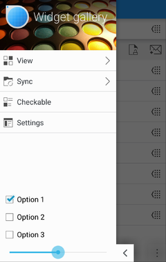
A Global Drawer may contain the following controls:
- Tabs
- A (possibly multi-level) main menu
- Push Buttons to execute non-contextual actions
- Checkboxes or Radio Buttons to change settings which are commonly changed
The main menu
- Must not have more than three levels
- Should, if possible, not contain more elements than fit on the screen
- Should contain an entry "Settings" in the last position if the application has settings which are not commonly changed
- Selecting an entry in the menu either executes an action or goes down one level, replacing the menu with the items in the selected submenu
- In lower menu levels, below the entries there is a button to go up one level.
Hide the drawer handle only on desktop applications if you need the sidebar to be always visible.
Context Drawer
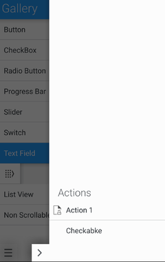
- At the top of the drawer, state which object the controls affect (e.g. "Selected email")
- By default, the Context Drawer simply contains a vertical list of action buttons which affect the currently selected/opened element
- Align the list of actions to the bottom instead of the top, to allow an easier reach with the thumb
- If needed, other controls related to the current context can be put in the Context Drawer
- Try to keep the content of the context drawer in one page. If there two distinct "modes" of contextual actions (for example navigating through a PDF either by table of contents or thumbnails), consider using two Tabs to separate them, but never use more than two tabs
Implementation
For the Global Drawer, use org::kde::kirigami::GlobalDrawer
For the Context Drawer, use org::kde::kirigami::ContextDrawer


