Promo/Old/Swag
It's been discussed that the promo team should have a list of goodies like shirts, hats, mugs, pens, stickers, etc. It was decided that we could achieve this with the creation of a KDE storefront that sells these things.
Design proposals
| Idea | Description | Proposed by | Designs submitted by | Approved? |
|---|---|---|---|---|
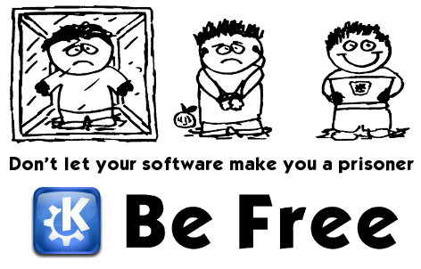
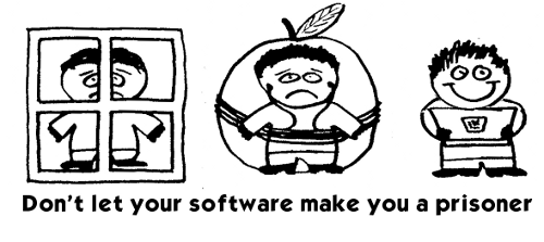
| PC v Mac v KDE | 3 people standing next to each other saying, "I'm a PC" (or "I'm Windows" in box w/ window, "I'm a Mac" tied up in mouse cord/ipod earphone cable, "I'm free" standing happy/unbound. Add KDE logo and "Be Free" slogan. | Stu | n/a | n/a |
| What is KDE? | Konqui, looking confused, asking "What is KDE?" with KDE.org and/or "Ask me" | Stu | n/a | n/a |
| I am KDE | "I am KDE" (optionally with "are you?") + some KDE logos or konqui | Stu | n/a | n/a |
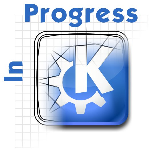
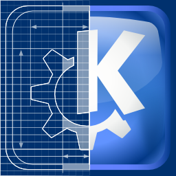
| KDE logo "in progress" |
KDE oxygen logo, with part starting out as a "blueprint" design (no colors, etc), but you have parts of the logo colored in and then part that is totally finished w/ gradient colors/details/etc. Transition of "in progress" to finished product type of idea. |
Celeste Paul |
Lee Olson |
n/a |
| KDE art past and present |
Chronological design that showcases KDE artwork past & present |
p.daniels (@teeahr1) on Identi.ca |
n/a |
n/a |
| KDE people | K logo (or Konqui) made up of faces of KDE contributors/users/anyone - slogan "KDE: The sum of its parts" | Stu | n/a | n/a |
| Part of the KDE Family | Konqi and Katie high fiving or engaging in other team/family activities with the text "Part of the KDE Family" (taken from our suggested branding for third party apps) at the front and the KDE Logo and a link to the "Get Involed" page. | Ryan Rix | Ryan Rix | n/a |
| Application Specific | Designs including app-specific logos or text (perhaps get feedback from each team) | Justin Kirby | n/a | n/a |
| Team specific | Designs geared towards certain teams in community, e.g. Promo team shirts or Artist team shirts, etc | Justin Kirby | n/a | n/a |
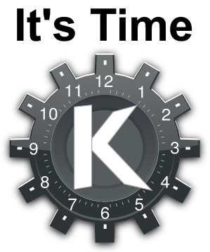
| It's Time | A merging of the gear logo and an analog clock (plasma?) with the K lying fully inside the clock as the hands of the clock, and the gear teeth running around the outside of the clock. Text above logo "It's Time", optional text below logo "For Linux on the desktop". Because Plasma is all about clocks :-) | John Layt | Lee Olson | n/a |
Design requirements for Spreadshirt
If you upload it in PNG format (pixel based) then it can have a zillion colors and it doesn't seem to matter. If you make one in this format I suggest something very high resolution and high DPI. Things still look good when you make them smaller but stretching pixel based images is bad I think. In general this format seems OK for something like Ryan's design I think.
The vector designs are supposed to be EPS format (I think?). I need to investigate this a little more. In the vector designs it does matter how many colors you use and using more does change the price. This seems to only be important if you want to use the design on some of the fancier items like baseball caps or laptop bags or something. It may also just be generally higher quality printing on the shirt but it's hard for me to tell from the info on the web site. We might need to just try having a shirt or two printed to see what the quality is like and make a decision about whether PNG uploads turn out decent looking gear or not. Just FYI...the designs Sebas posted are pixel based and seem to look nice on the web site. Maybe he can tell us if they look good in person if he's ordered one?
Pixel based: - use as much colors as you want - it is printed on a transparent film which is glued to the shirt - transparent parts glitter a bit so you can see the rest of the film - with time the transparent parts become a bit grayish - it looses contrast over time
Vector based: - colors don't loose contrast over time - no ghost-borders surrounding the graphic - max three colors - no gradients - all pathes have to be closed - all elements have to be curves (no simple lines, no text) - overlapping elements are not allowed - no element should be smaller than 1.5mm (0.6 inches) - space between elements has to be 1mm (0.4 inches) or more - keep the number of anchor points low (max 2000 per color) - keep the number of holes low (any hole has to be removed by hand) - use eps format
Design Development
Work in progress designs to be built upon
PC vs Mac vs KDE
Obviously needs a lot of work from someone who can do computer graphics (that's supposed to be an apple next to the second guy). We can change sex/race etc. Alternative metaphor for Mac would be to put the guy in a big rain coat. We want to avoid direct use of words like Windows and Mac or any of the trademarked logos.
Updated. This is front. Back could just be "Be Free", perhaps with KDE logo and certainly with web address. Probably I prefer the original Windows guy Stu
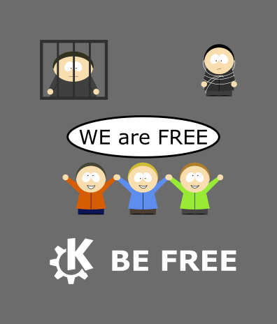
This is another graphic based on the idea. I think we should honor the community by saying 'we' instead of 'I'. If you have a question or are interessted in the svg source, just contact me Kame2
KDE Logo in progress
Ingo's, based on Celeste's suggestion:
Ingo's alternative take:
(This one could even work with a headline like "connect the pieces", which is indeed a nice ad - courtesy of Nightrose) --Neverendingo 00:45, 29 January 2010 (UTC)
Here's another idea for "In Progress" based on Celeste's suggestion: --Leeolson
Part of the KDE Family
It's Time
Here's an idea for "It's Time" based on John Layt's suggestion: --Leeolson
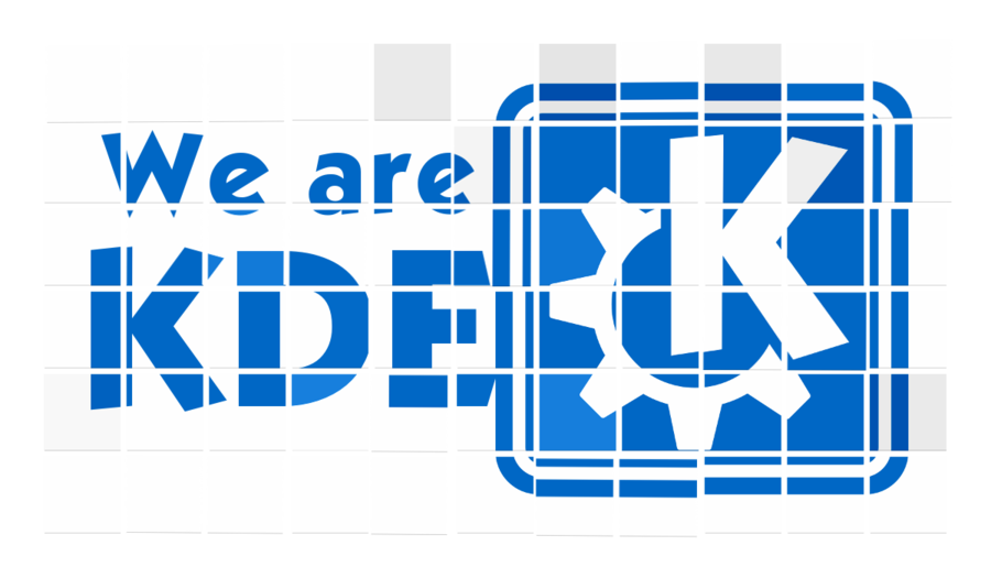
We are KDE
The idea is that it is supposed to look like a crowd holding up cards (like you see at football matches sometimes). Initially I think it could do with less cards (3x6, 2x4?) to make it simpler and maybe some hands holding them, or bits of people visible. Stu
Input / Output
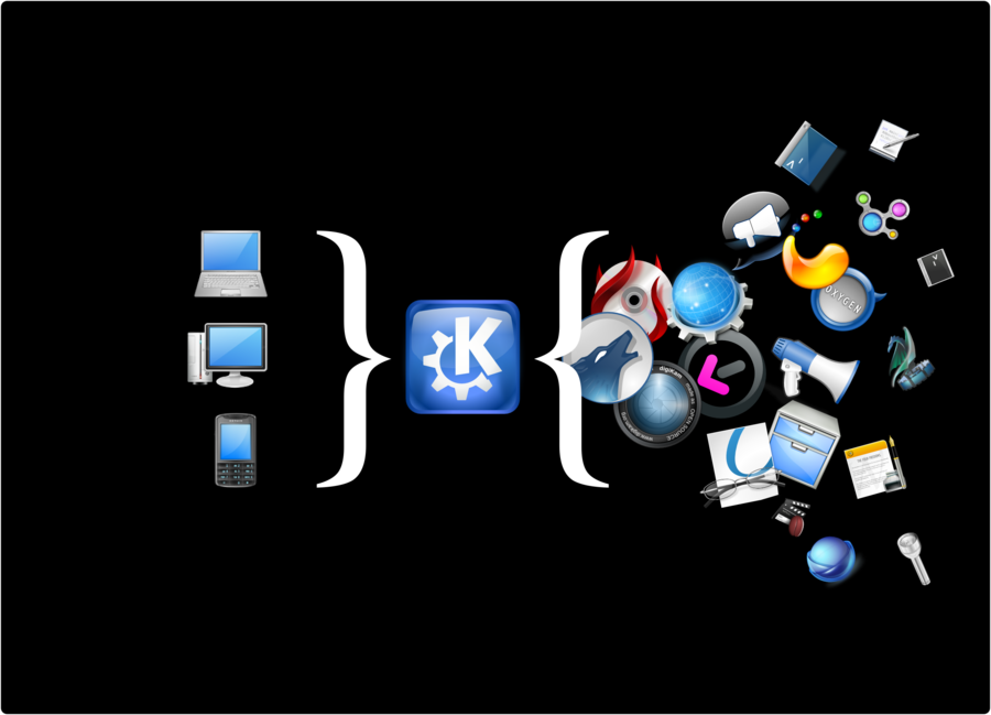
Give it almost any device and KDE can open up an amazing array of software and experiences. Designed to be free of text so it's a) International language friendly and b) Can be visually "read" in a glance. Is also deliberately OS agnostic. Why KDE "Vs" Mac and Windows? Don't we want people to use us on these platforms? (Yes, I run Linux :-)
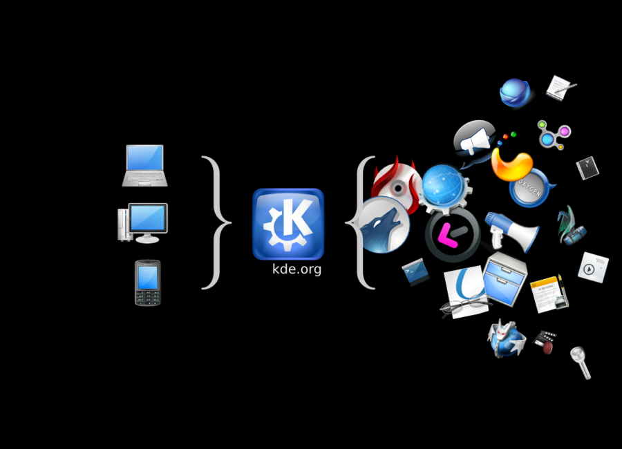
Revised version
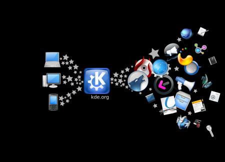
Revised version (Stu) using stars instead of brackets
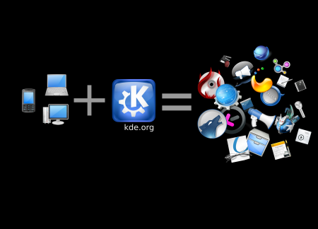
Revised version (Stu) using setting it up as a sum (loses the whole IO thing and probably a lot of the point)
What still needs to happen
- Identify artists willing to create designs based on these ideas (or based on ideas of their own)
- Collect these designs here on the wiki
- Have the Promo team "approve" designs for publishing on the store
- Have Justin or someone else with access upload them to Spreadshirt
- Ensure accounting/billing details are properly arranged and configured (maybe? might not be necessary)
- Advertise the existence of the store to the community
Longer term plans
- Work with sprint/conference organizers to provide event related designs
- Work with event sponsors to get them to order KDE gear through our store rather than going through some other channel to have them made

