Plasma/Plasma Media Center/Akademy2012
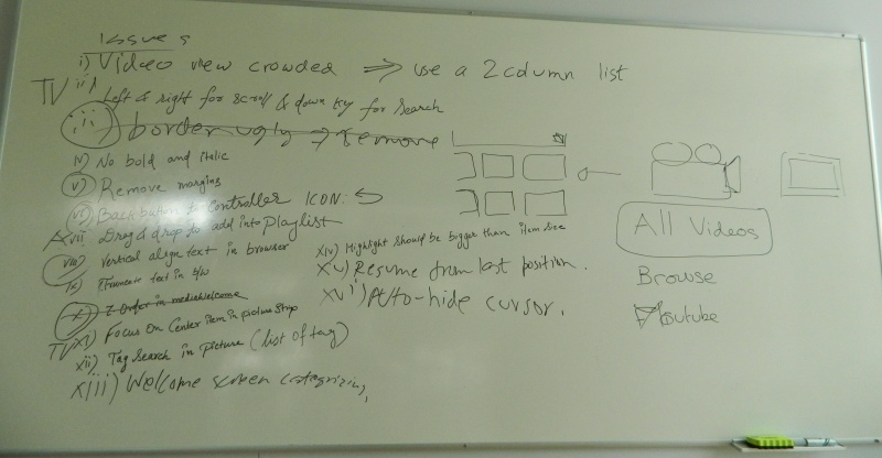
Improvements discussed at PMC BoF at Akademy 2012
- Have thumbnails for home screen items, remove recently played list from homescreen
Add spacing between progress and volume sliders- No browsing backends on plasma active
- Unhide the browser when playlist reaches the end
Show a toggleable current/remaining time next to the sliders- Add Places items to browsing backends
- Busy loading indicators whereever required
- Video view is too crowded, show lesser videos on the screen. Also, give an option for list of videos rather than a grid to show full title
- Handle keyboard/remote navigation as items are on screen. For example, pressing down button while at the bottom most media in the grid should switch to the Search panel
The new border shown in the Media Browser is ugly, remove itDon't use bold or italic on text- Remove margins from where not needed/they dont look good
Move the back button to the controller- Let the user drag-n-drop to the playlist
- Make the browser titles be vertically aligned with each other so they look consistent
- Elide text in the middle rather than the ends
- In Picture Strip, try to focus on the middle item
- Instead of typing out tags, its easier to select from a list
- Make item highlight bigger than the item
- Resume video from where the user left off
- Auto hide cursor while video plays
- Categorize the welcome screen (as the mockup on the drawing board)

