GSoC/2020/StatusReports/SaurabhKumar: Difference between revisions
m (→Upper buttons) |
|||
| Line 14: | Line 14: | ||
* Comment : A drop down menu which consists of a list of comments for storyboard items, a Delete Comment button and an Add Comment button. | * Comment : A drop down menu which consists of a list of comments for storyboard items, a Delete Comment button and an Add Comment button. | ||
[[File:Storyboard comment.png|thumb|Comment menu]] | [[File:Storyboard comment.png|thumb|center|Comment menu]] | ||
* Lock : A lock icon. It is used to stop adding item when keyframes are added in the Timeline docker. | * Lock : A lock icon. It is used to stop adding item when keyframes are added in the Timeline docker. | ||
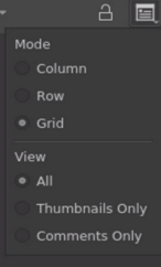
* Arrange : A properties icon. It consists of View and Mode options which can be used to change the arrangement of items in the docker. | * Arrange : A properties icon. It consists of View and Mode options which can be used to change the arrangement of items in the docker. | ||
[[File:Arrange menu.png|thumb|Arrange menu]] | [[File:Arrange menu.png|thumb|center|Arrange menu]] | ||
===Storyboard Item=== | ===Storyboard Item=== | ||
Revision as of 13:27, 20 August 2020
Storyboard Docker For Krita
A storyboard is a graphic organizer that consists of illustrations and comments displayed in sequence for the purpose of pre-visualizing and planning of motion picture and animation.
Introduction
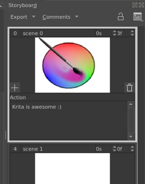
The storyboard docker aims to facilitate storyboarding in Krita. It allows multiple images and associated text to be organized in the form of a storyboard. The arrangement can be tweaked using the mode and view options. Also different field's visibility can be toggled. The storyboard can be rendered as pdf or svg.
Upper buttons

The buttons are :
- Export : A drop down menu which consists of the export option available for the storyboard.
- Comment : A drop down menu which consists of a list of comments for storyboard items, a Delete Comment button and an Add Comment button.
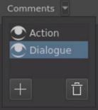
- Lock : A lock icon. It is used to stop adding item when keyframes are added in the Timeline docker.
- Arrange : A properties icon. It consists of View and Mode options which can be used to change the arrangement of items in the docker.
Storyboard Item
A Storyboard Item corresponds to a single panel in the storyboard. You can edit fields such as name, duration and comments. You can select the active item. You can add and delete storyboard items before or after any item. You can change the order of items using Drag and Drop.
Components of the storyboard item :
- Frame Number : This shows the frame number for this item in the timeline docker. This field is uneditable.
- Name : The item name, just do double- mouseleft to make it editable, and press the Enter key to finish editing.
- Duration in second : A spin-box. This will set the duration of the storyboard item in seconds.
- Duration in frame : A spin-box. This will set the duration of the storyboard item in seconds.
- Thumbnail : A thumbnail version of the canvas. Unlike the comments it cannot be edited inside, it show the changes made to the canvas with some delay.
- Add Item : A plus icon on the lower left corner of the thumbnail. It Adds a storyboard item after the duration of the current item. The new item will have the minimal possible duration, i.e. 0s1f.
- Delete Item : A bin icon on the lower right corner of the thumbnail. It Deletes the current storyboard item. Although it does not delete the keyframes at the item's frame.
- Comment Name : Name of the comment field. This field is not editable directly but can be edited from the Comment menu.
- Comment Field : The comment's content. It can be edited by double clicking.
Storyboard View and Modes
The View and Mode options are available in storyboard docker in the Arrange menu. These options allow you to arrange the panels in the storyboard.
View
These options allow you to choose which parts of the panel to show in the docker.
- Thumbnail Only : Only the thumbnail part of the panel is visible.
- Comments Only : Only the comments part of the panel are visible.
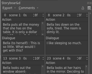
- All : All of the panel is visible.
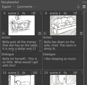
Mode
These options allow you to choose the orientation of the items in the docker.
- Row : Panels are arranged in a row-wise fashion. The panels’ orientation is horizontal in this mode. That means panels are on the sides of thumbnails rather than below.
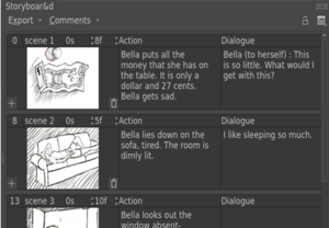
- Column : Panels are arranged in column-wise fashion. The panels’ orientation is vertical.
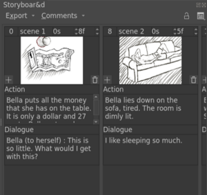
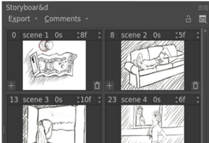
- Grid : Panels are arranged in a grid. Also if you change the size of the docker, the grid is rearranged to accomodate more panels in the docker.

Deliverables
- Link to Phabricator task: T12819
- Krita Artists thread: Storyboard feature plans and mockups
- Merge Request : !392
- Blogs : here
