Plasma/Plasma Media Center/Akademy2012: Difference between revisions
Appearance
Add minutes of Akademy 2012 BoF |
add whiteboard photo |
||
| Line 18: | Line 18: | ||
* In Picture Strip, try to focus on the middle item | * In Picture Strip, try to focus on the middle item | ||
* Instead of typing out tags, its easier to select from a list | * Instead of typing out tags, its easier to select from a list | ||
* Make item highlight bigger than the item | * Make item highlight bigger than the item | ||
* Resume video from where the user left off | * Resume video from where the user left off | ||
* Auto hide cursor while video plays | * Auto hide cursor while video plays | ||
* Categorize the welcome screen (as the mockup on the drawing board) | |||
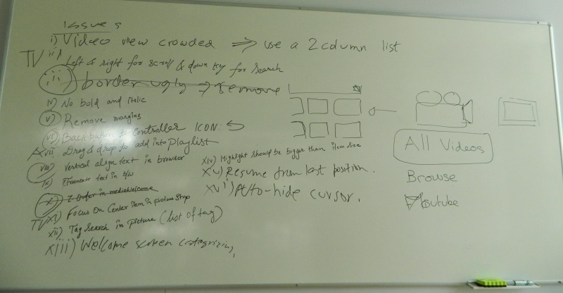
[[File:Pmc-akademy2012-whiteboard.jpg|800px|thumb|center]] | |||
Revision as of 18:02, 10 July 2012
Improvements discussed at PMC BoF at Akademy 2012
- Have thumbnails for home screen items, remove recently played list from homescreen
- Add spacing between progress and volume sliders
- No browsing backends on plasma active
- Unhide the browser when playlist reaches the end
- Show a toggleable current/remaining time next to the sliders
- Add Places items to browsing backends
- Busy loading indicators whereever required
- Video view is too crowded, show lesser videos on the screen. Also, give an option for list of videos rather than a grid to show full title
- Handle keyboard/remote navigation as items are on screen. For example, pressing down button while at the bottom most media in the grid should switch to the Search panel
- The new border shown in the Media Browser is ugly, remove it
- Don't use bold or italic on text
- Remove margins from where not needed/they dont look good
- Move the back button to the controller
- Let the user drag-n-drop to the playlist
- Make the browser titles be vertically aligned with each other so they look consistent
- Elide text in the middle rather than the ends
- In Picture Strip, try to focus on the middle item
- Instead of typing out tags, its easier to select from a list
- Make item highlight bigger than the item
- Resume video from where the user left off
- Auto hide cursor while video plays
- Categorize the welcome screen (as the mockup on the drawing board)

