Krita/Community Mockups and Wishlist: Difference between revisions
Created page with '== About == This page is a place for storing long term plans, suggested by users, mock-ups, wish lists. They are not official plans for Krita, but they can be. ;) == UI design ...' |
|||
| (One intermediate revision by the same user not shown) | |||
| Line 28: | Line 28: | ||
It a place where basic options for tools will be shown. | It a place where basic options for tools will be shown. | ||
=Brush tool= | == Brush tool == | ||
[[Image:Tool_bar.png]] | [[Image:Tool_bar.png]] | ||
| Line 103: | Line 103: | ||
# Widgets are white on darker back ground and black on brighter background | # Widgets are white on darker back ground and black on brighter background | ||
=== Color selector Types === | |||
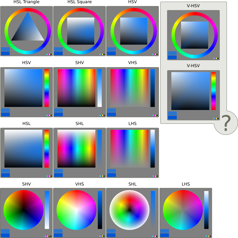
Color selector types and varieties. Paint Tools SAI haves additional V-HSV model, if someone knows something about them please contact me, for example on Krita IRC. | Color selector types and varieties. Paint Tools SAI haves additional V-HSV model, if someone knows something about them please contact me, for example on Krita IRC. | ||
Latest revision as of 11:01, 12 July 2010
About
This page is a place for storing long term plans, suggested by users, mock-ups, wish lists. They are not official plans for Krita, but they can be. ;)
UI design hints
- Allow easy and fast access to most used/useful tools. Make more space for them, by moving not as "popular" tools to menus and drop-down lists.
- More icons, less text.
- More simple visual informations for user. For example new slider widget, suggested by Peter Sikking.
- Two columns, it will make more space for needed sub-windows and tools. If someone wants more space for canvas, or he don't need one column, he should be able to delete it. Make hide windows option (ctrl + h) more exposed to user, it's useful if user wants more space for canvas, but needs two columns.
- Bigger contrasts. Better options organization, placement and separation. Help user to find landmarks on UI for better flow in working with UI, less time consumed by searching needed tool or option.
- User selectable color schemes, for more comfortable and efficient work with visual data. Example Kdenlive 7.7
First UI mockups/sketches
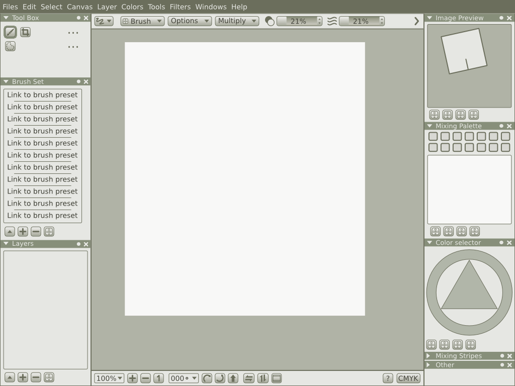
Default Krita window WIP #3
Menu
Tool box
Tool bar
It a place where basic options for tools will be shown.
Brush tool
- Tool stroke type, you can change type of stroke for tool using this drop down menu. Default should me free hand and under SHIFT + Mouse action the strait line stroke
- Brush Engines
- Options for Brush Ops
- Blending mode for brush
- Opacity
- "Flow" not yet supported, its and additional option for better control over opacity
- Sizes for brushes
- If user want good and fast control over brush he should use hot-kays
- Here he can type the size for brush form keyboard
- There is also drop down menu, with fixed sizes, if user wants to use always the same sizes (like in real life painting) he can easy use these
- The fixed sizes should by manageable by user in preferences or in different way
- Stroke smoothing options
- Smooths tracking of hand Option from 0-? (range form 0 to 15 will probably be the best)
- Smooths tracking and adds delay for brush tip (brushes with long bristle make similar effect)
- The sizes are fixed because there is no need for better control the user will not see the difference, menu is more readable,
Canvas
Canvas bar
Color selection and sampling
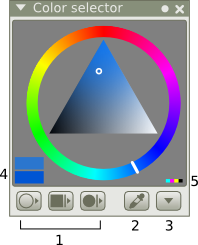
Color selector mockup
Many artists have different habits for color picking or they would be happy to use different color selectors. Some color selectors are better in some tasks.
- Color selector docker, with three menus, for three selector types and available varieties for them
- Rings with pickers, thanks to color ring artists can see color relations and it haves simple color picker with saturation, hue and value/lightness
- HSL Triangle
- HSL Square
- HSV
- Square, saves a lot of space for color picker and many digital artists are familiar with it
- HSV
- SHV
- VHS
- HSL
- SHL
- LHS
- RGB
- GRB
- BRG
- Lab (additionally)
- aLb (additionally)
- bLa (additionally)
- Wheel, its the most traditional approach for color selection, because its very similar to traditional color wheel
- SHV
- VHS
- SHL
- LHS
- Rings with pickers, thanks to color ring artists can see color relations and it haves simple color picker with saturation, hue and value/lightness
- Color sampler (works not only for color selector)
- Menu, with additional options
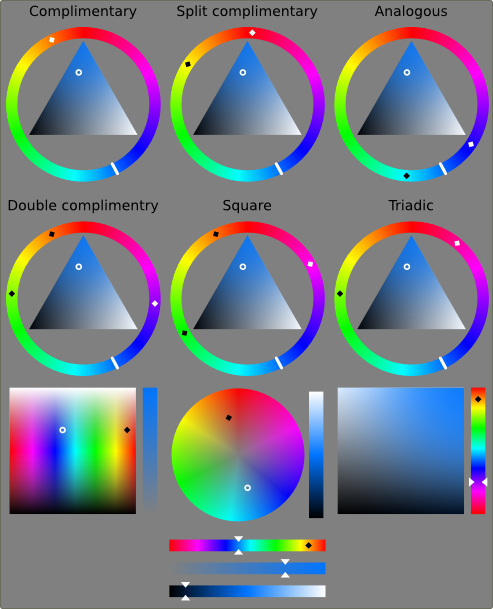
- Color harmonies
- Analogous
- Complimentary
- Split complimentary
- Double complimentary
- Square
- Triadic
- Interact button toggles on/off option for interactive sliders (sliders are changing their color, like Gimp sliders)
- Color preview on/off
- CMYK control on/off
- Color harmonies
- Color preview, top square shows new color, bottom shows last used, for comparisons
- When color will go beyond CMYK color space the CMYK icon will be shown
- Middle gray background for better color perception
- Widgets are white on darker back ground and black on brighter background
Color selector Types
Color selector types and varieties. Paint Tools SAI haves additional V-HSV model, if someone knows something about them please contact me, for example on Krita IRC.
- Color pickers, for example triangle, are not rotating, it's distracting and not comfortable for user.
- Positions of color pickers should stay as they are on mockups (they rotations, position of black and white)
Color selector models
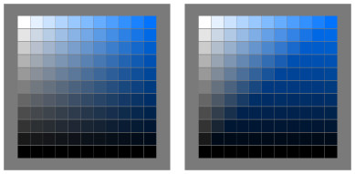
My experimental model for V-HSV, on left HSV on right V_HSV
Color sliders mockups
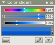
Color sliders should be separated docker from color selector docker, because some users like to have both at the same time. They are good detailed color preview. In menu, color preview on/off, CMYK control on/off It can be good idea to have color harmonies for sliders and of course interactive sliders option.
Color sliders types
- HSL
- HSV
- Lab (color selection based on color temperature)
- RGB
- CMYK
- Grayscale (for real not needed, HSL/HSV with 0 saturations gives the same but it can be for fun xD )
Color harmonies
Additional feature. NOT MUST HAVE.
Mixing sliders
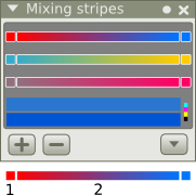
The idea behind this is to have a gradients mixing two colors (not only hues) as color picker.
- Color swatches here user can change color for mixing. User chooses color in for example in color selector and clicks here to "paste" this color
- Gradient. User by clicking on it picks the color, color depend on a place where he clicks
Layers
Preview
Brush Sets
tbc

