Amarok/Archives/Mockups: Difference between revisions
Mayankmadan (talk | contribs) (Created page with "== Better seek bar == 200px|thumb|right Viewing a song while you play it would be awesome. It should work like the preview on bleep.com. While amaro...") |
Neverendingo (talk | contribs) m (Text replace - "\[\[Category:.*\]\]" to "") |
||
| (4 intermediate revisions by 2 users not shown) | |||
| Line 1: | Line 1: | ||
== Better seek bar == | == Better seek bar == | ||
[[File:Cool-progress.png|200px|thumb|right]] | [[File:Cool-progress.png|200px|thumb|right]] | ||
| Line 14: | Line 15: | ||
== Tooltips in Collection Browser == | == Tooltips in Collection Browser == | ||
[[File:750px-Tooltipsincb.png|200px|thumb|right]] | |||
This is a mockup made by enr1x which shows the wish of having tooltips in the collection browser, with the useful info we expect from Amarok. BR: #129113 | This is a mockup made by enr1x which shows the wish of having tooltips in the collection browser, with the useful info we expect from Amarok. BR: #129113 | ||
== Tabbed playlists == | == Tabbed playlists == | ||
[[File:750px- | [[File:750px-Amarok-mockup-playlist-tabs.png|200px|thumb|right]] | ||
Yup, this suggestion has been around a long time, I just wanted to bring it up on the agenda again, if possible. =) | Yup, this suggestion has been around a long time, I just wanted to bring it up on the agenda again, if possible. =) | ||
| Line 28: | Line 30: | ||
User interface centered around the context browser. By Max Howell. | User interface centered around the context browser. By Max Howell. | ||
== Mockup Gallery Links == | |||
* Mockup gallery on ako: [[http://amarok.kde.org/en/gallery&g2_itemId=51113&g2_GALLERYSID=9012fc6d9cb3ce1e869a8c54dcc7e85e| Link]] | |||
* leinir's mockup gallery (mainly Amarok): [[http://leinir.dk/temp/gallery/mockups.php Link]] | |||
Latest revision as of 11:00, 14 December 2012
Better seek bar

Viewing a song while you play it would be awesome. It should work like the preview on bleep.com. While amarok is caching a song, the it could be analysed.
Moodbar seek bar improvement
For those of us that use moodbar to visually scrub through our music. The seek bar needs an option to change it's size (longer and taller) so you can see more of the moodbar whilst scrubbing. (Tip: Read the University study in PDF format on the moodbar page and learn how to use it properly, a new world of visual music will open up to you. -->Moodbar)
Amarok config

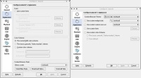
Mockup for the amarok config done by leinir
This is a mockup for a redesigned Appearence tab in the Amarok configuration window.
Tooltips in Collection Browser

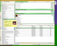
This is a mockup made by enr1x which shows the wish of having tooltips in the collection browser, with the useful info we expect from Amarok. BR: #129113
Tabbed playlists

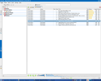
Yup, this suggestion has been around a long time, I just wanted to bring it up on the agenda again, if possible. =)
This mockup shows what it could look like (see top of the playlist). The tabs are taken from Konq.
I guess the main UI problem would be how to identify which playlist is currently playing, but there's definitely solutions to that. The tab's name could be in bold or so. / Nonplusx
Amarok 2 Mockups

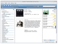
User interface centered around the context browser. By Max Howell.
