Calligra/Flow/Use cases
Disclaimer
The following document was created by a programmer, not a UI designer. It was done without the guide of any Designer or Design Book. Read at your own risk. Any constructive suggestions are welcomed at this pages' discussion. It is understood by constructive feedback, the feedback of the form: “The way you do it is not the proper way because [...] and you should do it this way […] because [...]”. Any other feedback will either discarded or given a much less priority (and chance) to be addressed or used. Finally, the document's intention is not to be an exact representation of the final document produced by Kivio, but a representation of the desired behavior and the expected possibilities for the new 2.x series.
Usecase 1: Bob the keyboard guru
Summary
Kivio's support to the keyboard-only work-flow should be of first class. The application should be powerful regardless of the way the user decides to interact with it. In this document such workflow along with the needed commands are proposed so that this can be archived.
Description of Bob
Bob is a programmer for The QCompany. He has to document every little detail of his work as a programmer so that those who might occupy his position know exactly what his design does and why. Being a developer, he hates the obsession that the diagram tools have for the aesthetics and the final layout of the document, what he really wants is not to have pixel-perfect control, at least not most of the time, but only describe his diagram and let the program handle the details of the positioning. Because he's a developer and power user, he hates using the mouse; he feels that he's much faster using only the keyboard and that any good diagram application, worth of calling itself diagram application, should allow this kind of interaction while being as least intrusive as possible to the user.
Bob's workflow
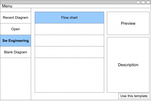
1. Bob has been given the task to document his most recent algorithm. He opens Kivio and select the proper type of diagram that he's about to do:
- The selection of the type of diagram helps Kivio adapt itself for the desired diagram. Of course, the user has the possibility of wanting a blank diagram to begin with, however, it should really be discouraged, that is because Kivio wouldn't know enough context to be as helpful as otherwise could be.
- Keep in mind that if what he wants to do is not a diagram (which is likely to be covered by one of the templates), he might want to use Karbon instead.
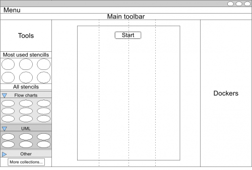
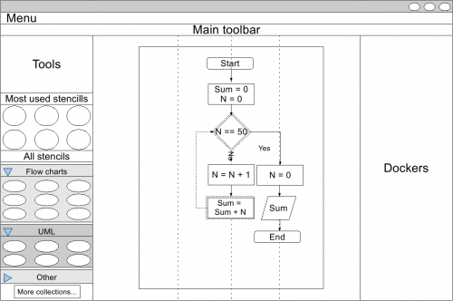
2. After he selects the Flow chart from the Software Engineering category, Kivio's main window is shown as follows:
- Note that since the user has told Kivio the diagram he is bulding, Kivio has adapted and has already inserted an starting block. Keep in mind that most (if not all) of the flowcharts start with an “Start” block. The block is already selected for easy use.
- Also note that three guides have been inserted. Those guides are there to help the user use the space more evenly. Kivio will automatically align all the new inserted shapes to the guides.
- Finally, at the left of the main window we can see the “Most used stencils” docker which prioritizes the most used stencils so that they are easily selectable for insertion. Under it we have the “Stencils docker”, a docker that shows to the user all the available stencils (grouped by their collection); also, it lets the user select all the stencil collections he wants to open for use.
- However, the user is not expected to use more stencils other than the predefined for the current collection, it is likely that if the user has to open another collection than the default then it's likely that they are incomplete.
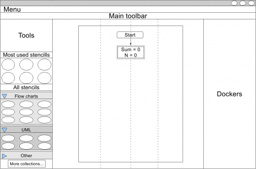
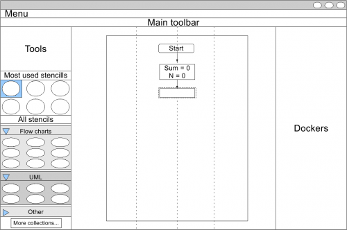
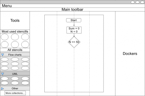
3. In order to insert the next block all what Bob has to do is press the Down arrow, a new stencil is inserted (in this case because it is the first one the most used shape is inserted, otherwise the last inserted shape is inserted). The logic behind it is that if the user press a direction that has no stencil then a new stencil is added, otherwise the selected shape is changed to the nearest shape in the pressed direction.
- Please note that the shape is selected by default.
4.Since the shape is already selected, Bob only has to type something for the text to appear inside the selected shape.
- When he's done typing he presses escape and he gets back to the current shape being selected.
5.The next stencil of the diagram is not a “Process” but a “Decision” instead. Bob presses Down, and then Tab, the focus goes immediately to the “Most used stencills” docker.
- The user can navigate through the stencils using the Arrow keys, and select it to be inserted instead of the selected shape using the Enter key.
6.Now that the selected shape is inserted Bob can start writing again the content of the shape.
7.Bob continues to add the other stencils he needs for the diagram.
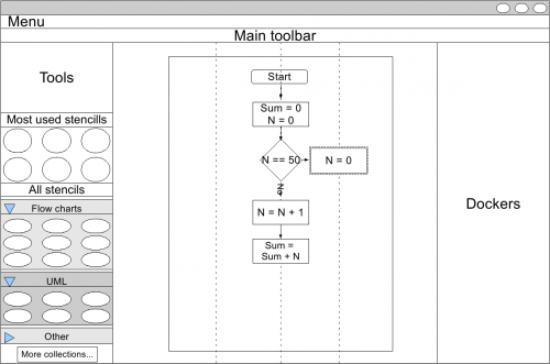
- He has to go back to the decision stencil and then press Right to insert the path for the rest of the flowchart.
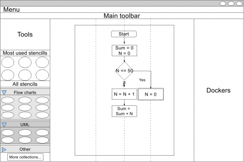
8.Bob sees that he really dislikes the place of the just inserted stencil, so he selects it and presses Control +Down Arrow, which moves the stencil one “unit” down, aligning it to the other shape.
9.Finally, Bob insert the final stencils. He then realizes that he's missing one remaining path.
10.Bob moves to the “Decision” stencil and then presses Alt +Select shape, when he releases the the Alt key Kivio inserts an arrow from the two selected shapes.
- Kivio is previewing the proposed connection between the stencils.
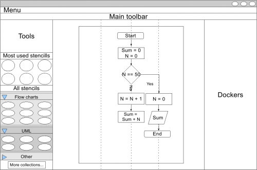
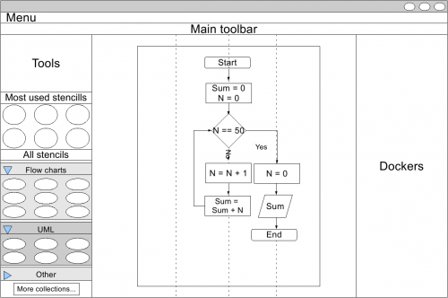
11.Bob finally has finished his very complex diagram and checks the result before printing it.
- Note that Kivio didn't have to resize the diagram (nor the text), but had the diagram grown more, it should have handled the case automatically.
Final thoughts
As can be seen, the final objective of Kivio is to let the user do the diagram and he take care of the details. Note that in the end the user can override Kivio's defaults but, if the defaults are properly chosen, it should be the exception, not the norm. Summary of commands
- Arrows: the four arrow keys, with no modifiers, have two uses:
- To move between the inserted stencils and their connections. If the direction in which the user presses has already an stencil, that stencil is selected.
To insert new stencils. If the direction in which the user presses has no stencils, the program insert a new one and selects it.
- Control + Arrow: the current selected stencil will be moved one unit to the pressed direction. What this means is based on the context, might be just a pixel or to align the shape to a grid.
- Alt + Arrow: the user is asked to select a shape, which can be done by navigating with the arrows, once he releases the alt key, a connection will be inserted between the stencil in which the user was when he initiated the action and the stencil he was when he released the alt key.
- Tab: the tab key allow the user to change the selected stencil for another one. When it's pressed the focus will be given to the stencil docker in which the user can navigate (through the most used stencils or all the open sets) using the keys, once the user has found the stencil he wants, he can press enter. The new stencil is inserted instead of the previously selected one.
- Delete: when the delete key is pressed it will act depending on the current state:
If the user has a stencil selected, then the stencil will be erased. Unless it is inserting text, if so, it will just delete the character right to the cursor position.

