Amarok/Archives/AKODesignBrainstorm
Amarok Website Design Brainstorm
Amarok.kde.org and the other sites (Rokymotion, blog, etc) need a new theme. That is, everything involving desing, from color scheme to layout. This is a brainstorm, so feel free to post your ideas about the new and fresh Amarok site!
- AJAX!!!!!!!!!!!!!!!!!!!!!!!!!!!!!!!!!!!!!!!!!!!!!!!!!!!!!!!!!!!!!!!!!!!!!!!!!!!!!!!!!!!!!!!!!!!!!!!!!!!!!!!!--apachelogger 22:22, 27 October 2007 (UTC)
- Not Oxygen hydrogen 15:26, 21 September 2007 (UTC)
- (Can) agree, but the colors should work well with the new Oxygen-colored logo -- maybe a whiteish theme? --Emunkki 23:00, 21 September 2007 (UTC)
- Links on the uppermost corner or floating box with useful links? Enr1X 15:33, 21 September 2007 (UTC)
- I think we need a special theming for the wiki (differ logged in users from not logged in ones) ... e.g. a thing like the current sidebar, shown depending on the login status--apachelogger 18:34, 21 September 2007 (UTC)
- very simple default design making it easier to get amarok (screenie -> information -> download), while still offering all the crap we need for development and project management stuff. therefore I think we should collect all this at a certain page and therfore also making everything one single link on the main page--apachelogger 22:34, 28 September 2007 (UTC)
- Somehow the mockup by clearbeast looks too familiar - too much the old layout :/ --Emunkki 11:05, 27 September 2007 (UTC)
- Agreed, I think we should really think about how we want to position news. News always was an important tool of Amarok marketing, plus our news are actully readworthy ;-)... still it's a fact, that most people who visit the website don't want news after all, but screenies and download and support.
- Maybe some
colourfuladjacent boxes under navi but over news for DL, screenies and some quick info?(I'll make a mockup of this today or tomorrow)--Emunkki 11:48, 29 September 2007 (UTC)- How about blue site with a white background or something?.The white is looking very plain & less appealing.Another idea I have is a changeable theme for amarok homepage.A small selecter at the side/top allowing the visitor to change the theme of the website..just like last.fm switches between red and black.There should be an utility sidebar allowing users to switch between screenshots,news and maybe something else.Sidebar will make the site more useful for the users to get everything on the go.Abhishektux 29,july 2008 tuesday
- Maybe some
- Agreed, I think we should really think about how we want to position news. News always was an important tool of Amarok marketing, plus our news are actully readworthy ;-)... still it's a fact, that most people who visit the website don't want news after all, but screenies and download and support.
Graphical brainstorm
-
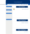
Mockup for the new website (not pretty yet, just placeholders to discuss and expand on)
-
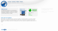
Mockup #2: Whiteish theme

