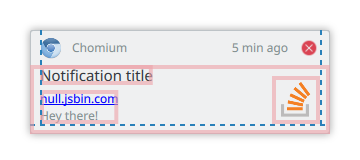
Plasma/Notifications
This page contains some ideas how to improve the Plasma notification system in order to move it forward and helping the user to become even more productive.
This page assumes the status quo as of Plasma 5.7 and org.freedesktop.Notification 1.2 specification. It only describes changes to be based on that, unless further clarification is needed.
Note that the 1.2 specification contains extensions proprietary to the GNOME project but this page treats those extensions as standardized functionality usable without further implications.
Places
Places notification history could show up
Desktop
|
|
|
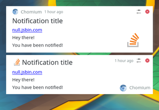
Notifications group "above" the desktop, not in any panel, plasmoid, ...
System tray panel
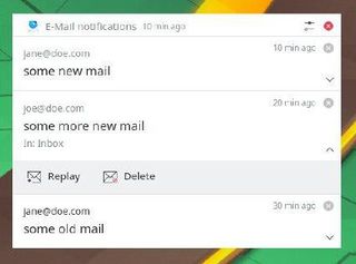
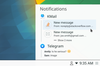
Notifications are grouped in a plasmoid that is part of a panel
|
Sidebar
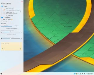
Notification plasmoid in a sidebar
|
Lock Screen
Notification is placed on the lockscreen
Plasmoid
A notification Plasmoid, the user can place anywhere on the desktop.
Unused Standardized Features
This section lists features that are currently part of the aforementioned specification but are currently either not provided as an API by the KNotifications Framework or ignored by the Plasma notification implementation.
Urgency
A notification may carry an “urgency” (byte) hint:
- 0 – Low, “Konqi signed on”, “You just plugged in your AC adapter”
- 1 – Normal, “You have new mail”
- 2 – Critical, “Battery level is critical”
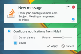
Plasma notifications could gain the ability to filter out notifications based on their urgency, perhaps either as a slider or a “Priority / Do not disturb” mode.
“Low” notifications like the example one are often pointless and could be disabled by default.
In order to avoid potentially revealing moments, Kwin does not raise windows of notification type above fullscreen windows, such as video players or ongoing presentations. A “Critical” notification might be worth displaying regardless.
It is up to the application developer to decide which urgency to assign.
If urgency is not specified, the notification should be treated as one of Normal urgency. Urgency might also affect the order in which the notifications are shown in the notification history.
Category
A notification can be assigned a Category. It can be used to provide more concise actions and grouping or the ability to filter out all notifications of a certain group regardless of which application emitted them.
The notification service might choose a different appearance for a notification based on its category. For instance, an incoming call notification might get a green “Accept” and a red “Decline” button with the user picture filling the notification window. A “User is now online” notification instead might get a very compact and unintrusive layout.
Action Icons
Currently, Plasma only shows the notification action text as actions are transfered as a string-list of alternating action Ids and action labels. A server might attempt to use the action name as ID for the action whereas Knotification always uses seqential Ids.
With the VDG strongly in favor of not using icons on buttons, it might not be worth implementing this in KNotification as it complicates the mapping code between invoked action and the signal the application is sent.
Resident Actions
Plasma currently removes actions from a notification, even persistent ones, once one has been triggered. TODO write more
New Features
This section lists features that cannot currently be provided in a cross-desktop way using the specification but require proprietary extensions in a KDE namespace.
It needs to be ensured that applications running in an environment without such extensions are not jeopardized and either an automatic fallback (determined by querying the notification server’s Capabilities) is in place or the offending feature is disabled.
Quick Reply
This enables the user to reply to an Email or SMS from within the notification. A “Reply” text field might be placed in the notification window whose content is eventually sent back to the application through the notification server.
This is not meant as a replacement for the Quick Chat applet of KDE Telepathy but as an easy way for other applications to provide a quick reply mechanism.
Notification windows currently do not accept focus which prevents users from entering text. Means of changing this need to be evaluated that do not cause the window to steal focus which was the reason for setting this particular window flag in the first place.
Notification services that do not support this simply won’t provide such functionality.
File Path
This allows an application to annotate a notification with a specific file path which the notification service could use to provide a richer/larger thumbnail and/or provide a common “Share” pattern to upload a file to a web service or send it to a contact, or simply open it in an application. Also, the ability to drag the file from the notification window elsewhere, e.g. into a web browser window, could be implemented.
This is particularly useful for notifications that notify about files being created, such as a “Screenshot Taken” notification, or a “File transfer from your phone finished”.
If the given path points to a directory rather than a file, opening said folder in a file manager could be offered. Perhaps even multiple files/folders could be passed, allowing us to replace the awful “File transfer finished” notification that currently just opens the last folder transfered instead of the parent-most folder that was actually copied.
Notification services that do not support this simply won’t provide such functionality.
Contact ID
This allows an application to annotate a notification with a specific contact ID which the notification service could use to provide more information about the contact this notification is related to. For instance, a notification about an email received by a certain contact could show his or her avatar with online status alongside options to start an IM conversation. This would use the KPeople Framework for querying contact information.
It needs to be discussed how it can be ensured that offered actions are sensible, ie. an incoming call from a contact won’t offer to start an IM conversation instead. Perhaps the offered actions need to be based on the category of the notification, cf. above.
Notification services that do not support this simply won’t provide such functionality.
Lock Screen Notifications
For privacy reasons currently no notifications are shown on the lock screen. A hint could be added to the notification that it may be shown on the lock screen. This needs to be configurable by the user and stored through notifyrc and the default needs to be evaluated very carefully.
A notification cannot be interacted with on the lock screen, neither closed, nor an action triggered. It could be considered showing the actions and upon invoking them focusing the password field and triggering the action after the session unlocks. As there are currently hardly any persistent notifications, there’s usually not much to show on the lock screen and since the notification UI code is quite complex, it might not be worth the effort to implement this feature.
Re-thought Notifications
This section lists notifications that we currently show to the user and contains ideas on how to improve them, make them less intrusive, and/or get rid of them entirely.
Completed file transfer
Notifying about a completed file transfer in a persistent notification is absolute overkill.
A non-persistent one is okay so that users know they can now work with the file at the place they copied it to, but having it persistent makes no sense, because if you return to your PC after a while and see neither an ongoing file transfer nor an error message, you know it has completed successfully.
Error messages should be persistent, however.
As a general rule: Persistent notifications should only be used to inform about something which is - Important - Unexpected
Crazy Ideas
This paragraph lists some crazy ideas that we could toy around with:
- Notification sidebar
- Place an icon in tray for every application that has a notification (cf Android)
- Keep all notifications in a backlog but don't annoy with that (ie. no stupid "1" icon if it's irrelevant)
- Better notification merging (eg. for new emails)
- Notification in backlog but not as popup (new song popup is annoying but might be handy to have a history of that?)
- Another idea (a more complex one) is to:
  1) Introduce a top-level "sidebar" object (like panels) that users would be able to locate at screen sides of their choice and fill with plasmoids (like in Deepin)
  2) Make a backlog plasmoid. Users will be able to place it where they want, including sidebars.
- Check feature parity with Android notification API to eventually integrate Android apps with Plasma notification system.
Drafts
This is just a proposal, fell free to edit/append
Stuff that will be addressed by later versions of HIG:
- Responsive layouts. e.g. icon only history for a small sidebar
- Advanced sorting of notification: by urgency, category, ...
- Expandable notification body in History
Notification popup
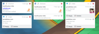
Notifications in the Notification popup are shown as they happen, are "above the desktop", close automatically after x seconds.
|
Options
The user can configure these options:
- Timeout: value for fade out
- Mute: Don't play any notification sounds
Appearance
Notifications are grouped by application and are sorted by date of there newest notification descending. Applications inside a group are sorted by date of the newest notification. Notification are always expanded, there is no toggle for un- / expand.
NOTE: All specifications for margins, width, height, ... are in units.smallSpacing.
Single Notification
Structure

|
A single notification consists of three sections:
- Header
- Body
- Actions
Header

|
- App Icon, units.iconSizes.smallMedium, if clicked the configuration for this type of notifications opens
- App name
- Age, the time since this notification happend. Font size: 12, color: ForegroundInactive
- Dismiss button, units.iconSizes.smallMedium, dismiss this notification
All four are vertical center aligned in the header.
Margins:
- 2 between left and App Icon
- 2 between App Icon and app name
- 2 between age and dismiss button
- 2 between dismiss button and right
Body
|
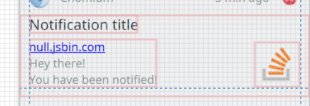
- Summary, single line head line for the notification. Font size: 14, color: ForegroundNormal
- Body, Up to three lines of the body are displayed, It may contain simple mark up. Font size: 12, color: ForegroundInactive
- Notification Icon, units.iconSizes.large, optional
Margins:
- 0 between summary and top
- 1 between summary and body
- 2 between left and summary, body
- 2 between icon, body and bottom
- 2 between icon and right
- 2+ between icon and top
Action
|
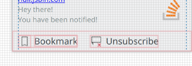
Actions are optional. Up to three actions can be provided by the notification. An action is displayed as an button with icon and text. the action area only gets displayed if at least 1 action is available. The action area has a height of 7.
- Icon, units.iconSizes.smallMedium
- Text, Font size: 14, color: ForegroundNormal
The actions are vertical center aligned in the footer.
Margins:
- 1 between icon and the text
- 4 between 2 actions
- 2 before the first button
Grouped Notification
Structure
|
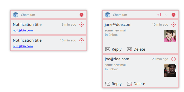
A stack of grouped notification consists of two sections:
- Header, common for all notifications of this group
- a stack of grouped notifications
Header

|
- App Icon, units.iconSizes.smallMedium, if clicked the configuration for this type of notifications opens
- App name
- +X, is only visible if more then 2 notifications are in this group and the group is not expanded. Font size: 12, color: ForegroundNegative
- Expand toggle button, units.iconSizes.small, is only shown if there are more then 2 notifications in this group
- Dismiss button, units.iconSizes.smallMedium, dismiss all notification of this group
All are vertical center aligned in the header.
Margins:
- 2 between left and App Icon
- 2 between App Icon and app name
- 2 between +X and the expand toggle button
- 2 between expand toggle button and dismiss button
- 2 between dismiss button and right
Body
|
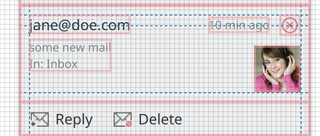
- Summary, single line head line for the notification. Font size: 14, color: ForegroundNormal
- Body, Up to three lines of the body are displayed, It may contain simple mark up. Font size: 12, color: ForegroundInactive
- Dismiss button, units.iconSizes.smallMedium, dismiss this notification
- Notification Icon, units.iconSizes.large, optional
- Age, the time since this notification happend. Font size: 12, color: ForegroundInactive. The age is center aligned to the dismiss button
Margins:
- 2 between summary and top
- 1 between summary and body
- 2 between left and summary, body
- 2 between icon and bottom
- 2 between icon and right
- 2+ between icon and close icon
Action
See single notification actions.
Behaviour
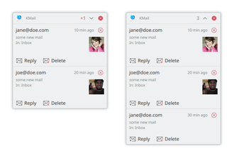
If a group contains more then 2 notifications, the notification group is shown unexpanded. In the header a toggle button for expand/unexpand and the number of the additional notifications are shown. When expanding a notification group all notifications are displayed. In the header the totoal number of notifications is displayed, instead of the number of aditional notifications.
|
Behaviour
Closing
Notifications close automatically after X seconds. All notifications use the same timeout, the Expiration Timeout property of the notification is ignored. To ensure that the user sees the notification, the timer does not start when:
- the session is locked
- notification is not visible. e.g. an application on the same screen as the notifications is in full screen mode
- session is idle (no mouse movement, no keyboard input, ...)
- mouse pointer is over any notification
When the mouse pointer is over any notification the timer for all notifications are stopped and are reset.
Urgency
A notification may carry an “urgency” (byte) hint:
- 0 – Low, “Konqi signed on”, “You just plugged in your AC adapter”
- 1 – Normal, “You have new mail”
- 2 – Critical, “Battery level is critical”
Plasma notifications have the ability to filter out notifications based on their urgency.
“Low” notifications like the example one are often pointless and are be disabled by default. In order to avoid potentially revealing moments, Kwin does not raise windows of notification type low and normal, when DND is enabled. DND can be enabled either by user action or can be requested by applications, eg fullscreen windows, such as video players or ongoing presentations. Critical notifications are displayed regardless.
It is up to the application developer to decide which urgency to assign.
If urgency is not specified, the notification is treated as one of normal urgency.
History
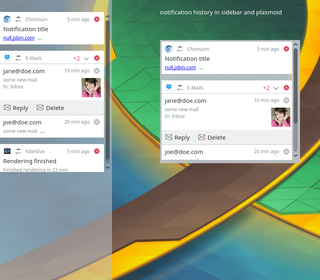
The history shows notifications that have not been dismissed and have a urgency of normal or critical
|
Options
The user can configure these options:
- urgency threshold:
- low: all notifications appear in the history
- normal (default): normal or critical notifications appear in the history
- critical (default): only critical notifications appear in the history
Appearance
The history can be placed:
- In the sidebar
- as a plasmoid on the desktop
- be part of the systray
Notifications are grouped by application and are sorted by date of there newest notification descending. Applications inside a group are sorted by date of the newest notification.
Behavior
To dismiss a notification:
- click on the close button or swipe to the left of the notification
- click on the close button or swipe to the left in the group header will close all notification of this application
- an application can clear all its notification, typically this happens when the application gains focus
- an action button is clicked
- a session logout dismisses all notifications
Notifications are grouped by application and sorted by date.
Lifetime
There a 2 differernt types of notifications regarding lifetime.
not persistent
do not add the notification to the history. When the urgency is below the configured threshold, the notification is only shown as Popup, but not in the history.
Examples
- Amarok, "Now Playing"
- Chat Online/Offline messages for other users
persistent
Add notification to the history. When the urgency is equal or above the configured threshold, the notification is added to the history. This does not necessary mean all notifications are actually shown in the history, but it indicates that multiple notifications of this type can be interesting to the user. Examples
- New Mails
- Chat messages
Application using persistent notifications must invalidate notifications, that are no longer needed or of interest to the user. Examples
- a persistent Low Battery notification must be invalidated as soon as a power connector is plugged
- a new mail message notification should be invalidated, if it is read
Timeline
The timeline shows all notifications sorted by date and not grouped by application. You can not dismiss a notification from the timeline, neither will clear a session logout the timeline.
Mockups
https://share.kde.org/index.php/s/LlRp2A56hZEuEGc
Efforts
This section lists applications and notifications that should be updated to provide a better user experience with the new system.
DesktopEntry in notifyrc
The new notification system will be able to manage applications not using KNotifications by using the desktop-entry hint provided in the notification. This will allow us to split settings into "system services" and "applications". However, KNotifications uses the application name for identification rather than the desktop entry, so a DesktopEntry hint must be placed in the respective notifyrc file, so they can be filed under "applications". For Frameworks 6 it should be considered whether notifyrc infrastructure could be updated to work on desktop entries by default instead.
The following is a list of applications that should be updated to include this entry. For example, Spectacle has a spectacle.notifyrc file defining its notifications. Its desktop file is called "org.kde.spectacle.desktop" so you want to add a DesktopEntry=org.kde.spectacle to the [General] section of its notifyrc file.
| Status | Application | Comments | |
|---|---|---|---|
| DONE | Kamoso | ||
| DONE | KGet | ||
| DONE | Konsole | Check what this means for konsolepart | |
| DONE | Konversation | ||
| DONE | KTeaTime | ||
| DONE | Spectacle | ||
| DONE | Yakuake | ||
| DONE | Amarok | ||
| IN PROGRESS | Discover | Discovernotifier isn't in Discover but it's still "Discover" as far as the user is concerned | |
| IN PROGRESS | KDevelop | ||
| TO DO | KTorrent | ||
| TO DO | KMail | Many notifications are provided by "agents" that aren't part of KMail | |
| TO DO | Kdenlive | ||
| TO DO | Digikam | ||
| TO DO | Krfb | ||
| IN PROGRESS | Lokalize | ||
| IN PROGRESS | Quassel | ||
| TO DO | K3b | ||
| TO DO | KStars | ||
| TO DO | Juk | ||
| TO DO | Latte Dock |
Notification cleanups
The following lists sections for notifications that should be removed, reworded, have a default action added or an urgency set.
| Status | Notification | Comments |
|---|---|---|
| DONE | PowerDevil "Critical Battery" | Set Urgency to Critical |
| DONE | PowerDevil "Critical error" | Remove, it's usually a symptom of packaging woes |
| DONE | Spectacle "Screenshot saved" | Set default action, remove "Open" button, especially redundant with thumbnail feature |
| DONE | Amarok track change | Track changes set to low urgency
|
Links
- https://wiki.ubuntu.com/NotifyOSD
- https://developer.gnome.org/notification-spec/
- https://material.io/guidelines/patterns/notifications.html

