Calligra/Ideas/Colordialogs
Proposal for color dialogs in KOffice
On dec 27th we held a meeting on irc discussing color dialogs. This is not a transcript but rather a proposal based on those discussions.
Usecases
In KWord, KPresenter and KSpread the most common case is defining the color of the font and it's background. This come in two ways:
- Directly while writing. Say you are writing and want to change the color of a few letters or more. Or in KSpread you might want to change the color of several cells
- Indirectly when defining styles. Here you set the property of the style.
In both cases you want a quick way of defining the color but you don't want to waste too much space in the user interface of the application as color is not that important.
KWord, KPresenter and KSpread also have the possibility to add shapes, so some form of defining color for shapes are also needed.
In Karbon you generally create paths and then add gradients to them. (workflow described by Nuno Pinheiro). Sometimes you add solid color to them instead (Enkithan says he does this more often in his cartoonish way of drawing). When defining the gradients you need to define the stop colors. Here you also want a quick yet space saving way of defining colors.
In Krita you generally choose the color you paint with and for some paint ops you also need secondary colors like fill of rectangles etc. In Krita you can also define gradients, which although not the same type of gradient as in Karbon would be defined in a similar way.
The KoColorPopupButton
For simple cases like KWord, and defining gradient stop colors, and secondary colors in Krita we proposed a KoColorPopupButton. It can take two forms corresponding to the direct and indirect usecases of KWord et al. Both are toolbuttons, but with popup mode of either MenuButtonPopup or InstantPopup respectively. Note how the MenuButtonPopup has a vertical line. Also the InstantPopup don't have an icon as this is used as a property, wheras the MenuButtonPopup is an action.
The popped up dialog is the same, but in menu mode you can also click the button without the popup appearing. When you click it like that the current color is just applied (remember this is for the direct usecase).
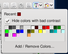
Anyway the popped up dialog should contain a swatch/palette of colors including recently used colors. This dialog could look like this:
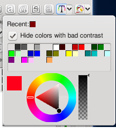
This would probably work for KWord et all, but for defining gradient stop colors in Karbon the user is most likely (again according to Pinheiro) to choose special colors every time. So having to click the add/remove button to select a custom color would be too tedious. So the proposal is to instead let the popup look like this mock:
This would allow instant selection of the color. The red color patch to the left of the triangle allows you to see the color you are mixing (wanted by the artist enkithan). when clicked it will bring up and advanced color selector (see below). Also note that the triangle selector hasn't been decided yet. It could just as well be a wheel or something different.
This extended popup could either be for Karbon and Krita only, but I suggest that it should look like that all over KOffice.
In Krita and Karbon the "hide bad contrasting colors" should be hidden. And for other apps it's suggested to use an opposite (and less scary) wording like "Show more colors"
The small color selector
We generally agree that he small color selector works fine for what it's supposed to do: be a small docker that is always visible. Enkithan stated that he need a way to see the color he is mixing. We discussed that a color patch should be there and that clicking it should bring up the advanced color selector (see below)
The color swatch
The color swatch from the above KoColorPopupButton should be a docker in its own right. Though without the triangle below. we believe this is already the case in Krita.
The styles docker is dead, long live the coloring tool
Based on discussions with Pinheiro about workflow when drawing with vectors: The styles docker, the gradient and pattern tools will be turned into a single super tool called the coloring tool. When drawing artists generally first draw the path and then apply the gradient, sometimes they apply a solid color and rarely(if ever) do they apply a pattern.
The coloring tool have 4 tool option dockers:
- The target selection docker. where you select either stroke or background as the target of the tools actions. In the future this might support multiple stroke definitions, but for the moment only one stroke is defined
- The pattern docker. Mostly like the current pattern tool. Here you can select a pattern from a combo pulldown.
- The gradient docker. Mostly like the current gradient tool. Here you can set up a gradient including stops etc.
- The solid docker. Here you can select a solid color for the background.
The death of the dual color button
During the talk it was suggested that the dual color button is old technology, and that we could do better. The dual button is used for two purposes.
- as a way to quickly switch between two colors
- to define the background color for some paint ops or shapes
As far as the quick switch goes we could do better by having a series of recent colors available in a swatch. And as far as the defining of background then it could be solved by having special properties at the appropriate places. The above coloring tool is already one such example. The Krita rect tool would be another where in the tool option you'd select the fill color.
Just a quick note on why the background color is too old fashioned: you could easily think up of a tool or a paint op that would need more than 2 colors. And the coloring tool above speaks about more than one stroke color (already a feature of Adobe Illustrator). Again the dual color button comes out at a loss.
So we simply propose a single color button. It should still bring up the advanced color dialog (see below) when clicked. Any additional colors are chosen at the place where they are needed (as a KoColorPopupButton).
Note that the recent colors swatch should be global - so that a recent color in one dialog shows up as a recent in every color dialog.
Advanced color selector
We didn't get as far but Lukas have prepared a blog about such dialogs in other applications. This dialog will be the subject in the next irc meeting.
http://lukast.mediablog.sk/log/?p=55
Opacity as part of color
We discussed whether opacity should be part of the color dialogs (as Karbon does it) or as part of paint op (as Krita does it).
The main topic was whether Krita should follow how the rest of KOffice does it, but since it's a difficult topic we'll postpone it for 2.1.
Pro changing Krita:
- Commonality with the rest of KOffice, which seems very important now that you can mix and match paths into Krita
- Opacity is logically a property of the paint (as in how diluted the paint is)
Con changing Krita:
- It works as it is
- Opacity is logically a property of the paint op (as in how hard you press with the pen)


