KDE Visual Design Group/KirigamiHIG/Principles/OneHandedUse
One-Handed Use
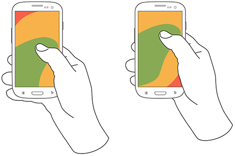
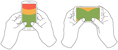
According to research, about half of users use their phone with just one hand in a given situation. This limits the areas they can comfortably reach with their thumb. The safest way to hold a phone in one hand is resting the bottom end in the palm. Another 15% hold them in the palms of both hands. Both ways to hold a phone make the top of the screen hard to reach.

Reachability of screen regions in one-handed use. Source: UXmatters

Reachability of screen regions in two-thumbed use. Source: UXmatters
Kirigami's phone components are therefore optimized to favor the center or bottom of the screen for primary interactive elements, while putting secondary elements into drawers which can be opened from up to three different points of the screen and then again favor the lower parts of the screen. It also has an "overscroll" feature, which allows you pull down the top part of the screen in case you have to reach e.g. the topmost items of a list.
When using Kirigami, make sure that often-used controls are never placed at the top of the screen, and also avoid the screen corners in general.
