Plasma/Plasma UX improvement project
About
Plasma UX improvement is a student project undertaken by a group from The Norwegian School of Information Technology in Oslo, Norway. The project is organized as a part-time internship at Nokia Qt Development Frameworks in Oslo. The project started in January 2012 and will finish in mid May 2012.
Goal
The goal of the project is to analyze the Plasma Active User Interface, identify elements with potential for improvement, and create prototypes of alternative solutions with the goal of improving user experience.
Areas of Focus
The project has chosen to focus on some key elements of the interface. The elements chosen are all central ones which most users will interact with frequently. Suggestions for improvements are based modern theories of user interface design for touch devices.
Browser
- Touch response from interface elements
- Set-up based on Activity
- Icon conventions
- Touch scroll and zoom
Keyboard
- Keyboard design document below
Peek&Launch
- Drag and snap functionality
- Tap and double-tap function
Activity Selection
- Opening adjustments
- Size of activity area
- Tap to open
Note: This page will be updated as work progresses, and code will be made available.
Browser Design Document
Introduction
This document covers the in-depth design aspects of the new QT Browser, planned for prototyping and implementation on the We-Tab.
Why improve the browser usability?
The browser is one of many things on the Plasma Active user interface that utilizes many of the elements that we want to improve in out project. It has the ground structure for a functioning application, yet lacks finesse in intuitive control. Things such as buttons, text fields, and scrolling, zooming as well as other functions could be improved greatly with simple design conventions and structuring.
Issues with the current browser
As it stands, the Plasma Active 2 web browser is operative and works to the extent that it needs to, but certain things could be changed in order to improve the user experience. They are as follows:
Icon conventions
The icons in the browser follow new icon conventions, not really descriptive of their functions. In their own right, they make sense from a user perspective, but only if the user unlearns the icon conventions of previous browser experiences. Some issues with icons are not apparent in the browser alone but throughout the Plasma Active interface. For example, the “Magnifying glass” is an icon used to imply search functions. Placing such an icon in a text field would be sufficient to tell the user that this field is for searching. Other times however, the magnifying glass presents the option of zooming in the field of view. Also, when searching, the icon that implies that a search is being conducted is in the shape of a flashlight. This could leave users to believe that looking for such an icon would lead them to a search function, when in reality it may as well zoom in the view for them.
In the browser, the address bar where the URL for websites are written has an icon for deleting the current content of this bar (represented as a black circle with a white cross in it). Beside the URL bar on the right side (thus close to said icon) is the “stop” icon for canceling the loading of a website. This icon differs in size, but is otherwise identical to the “clear address field” button. Placed so closely together, this can cause confusion in users.
Another concern with central icon elements is the “Favorites” button, displayed in the browser as a heart symbol. Logic makes this a viable choice for a favorite-label, but seeing as almost browsers that leaves the user a choice for marking material in this way (Youtube, Spotify, and various internet browsers) use stars symbols to mark a favorite, we feel that this might be the safe approach in this case too. We want to make users feel like they can understand any interface from the get-go, but we also want people to recognize familiar elements.
The issues with the icons are not the most important aspects of this browser prototype (as it will represent designs in the browser alone), but in a tablet in general, icons are more often interpreted at first glance, making icons, and their descriptive nature very important to keep organized and uniform.
Responsive interface elements
A loading icon is a good way to show the user that something is happening, and that he can now patiently wait, as there is no delay of any kind, but his request is being processed. Early testing done by the team members showed that the lack of response from the buttons and requests actually made the user click the same buttons over and over, resulting in a pile-up of processes (i.e. opening 10 browsers at once or pressing “search” several times, resetting the search query over and over instead of carrying it out).
The same lack of response is found in the pressing of buttons. The natural way to go about this is giving the user a sensation through touch or visually, whenever a button is pressed. A subtle vibration from the device is not possible with the current hardware, but visually showing the button changing shape/color certainly is. Even small changes to the element give the user a feeling of response from the device, telling the user that his input has been received.
As far as buttons go, borders are very important. The user must always know what areas of the screen will record input. All buttons should have a border, representing the area of where the button can be touched in order to be activated. Borders also help differentiate between what is an idle icon and what is an actual button.
Scrolling and zooming
Navigating through a website or online content on a touch screen usually entails these two things. We read a text, and we scroll down almost as we would trace our text in a book with the tip of our fingers. The hand-to-eye coordination is in perfect balance, because the scrolling sensitivity feels as if the activity itself was affected by natural physics. Scrolling with Plasma Active, there is not always a way to scroll with the finger. Sometimes, the scroll bar on the right side of the screen has to be used, and it’s not always a comfortable way to navigate. What used to be natural for us is now mechanically boxed into this feature that is both inaccurate and oversensitive. We want to standardize the way users scroll, so that all scrollable planes are using the same option, and will never force the user to result to using a scrolling bar.
Zooming is also problematic because it leaves the user with the choice of pressing a button to enlarge the window, yet to a predefined default. Being that web pages are all different in shape and size, this option could mean the content is enlarged too much, or too little. The dominant design for zooming in most every device these days is the “pinch-zoom”, where the user can change the size of the field of view by performing a “squeezing” motion with two fingers pressing toward each other or away from each other (while touching both fingers to the screen). This will respectively zoom in and out.
The Peek & Launch bar vs. a whole new bar
An element that is always present on the Plasma Active is the “Peek & Launch” bar (P&L). This bar is part of the global interface, meaning that whatever the user is doing on the tab, this tab is always present, and ready for use. The bar itself is hidden on the whole width of the top of the screen.
The initial idea for an earlier design was to change the P&L bar to accommodate use of the browser, making the P&L context sensitive to the application that the user was in. This has been changed to a general bar for the browser alone, functioning in the same way as the P&L, but not replacing it. We found this to be a better solution for the project. For changes to the P&L bar directly, see its respective design document.
Functions of the dropdown bar
With the top toolbar ever present on screen, this means that it should be able to present the user with options that are relevant to the task he is currently doing. The design for this bar will rely heavily on the design of the P&L bar, acting similarly to it in a lot of ways. Seeing as the bar can be pulled down in two “steps”, the first one revealing the current open programs (as well as the system tray) and the second level of the bar (revealed when pulled down even further) revealing programs available to open, this “tiered” dropdown is a good idea for organizing elements.
For instance, the idea of the browser using this mechanic is to have the first level of the dropdown show options as such you would have in a normal browser, like a back and forward button, a search bar, an address bar, and a refresh button. To be clear, this is the part of the bar that is shown on screen at all times, and is not dropped down at will. For reference, we call this UI level 1.
Keyboard Design Document
Introduction
This document will cover the design aspects in-depth for the new keyboard, which is planned for prototyping and implementation on the MeeGo-based WeTab tablet computer.
Issues with the current keyboard design
We found that the keys on the current keyboard design were too narrow for people who might have larger fingertips than normal. They would sometimes hit the wrong key when they were trying to press the one adjacent to it.
There were also some keys that we deemed unnecessary to have present on the main touch keyboard. Keys like the semicolon (;), apostrophe (‘), backslash/slash (/, \) and the brackets ([]) could be removed from the main keyset and accessed via the special symbols keyset which already exists. The Tab-key, for example, is no longer necessary when using a touch keyboard. Its function can be emulated by simply touching the text field. The spacebar is also very long and takes up quite a lot of space on the keyboard, and could be shortened.
One of the things we were concerned about was the obstruction of the screen when using the keyboard. On the original, one could tap the arrow button to anchor the keyboard to the top or the bottom of the screen. We could not think of why anyone would use the keyboard on the top enough for this to be included, and removing the arrow icon can free up horizontal space on the keyboard.

Fig.1: The existing keyboard design in Plasma Active, showing the lower case letters
What could be improved?
With issues from the current design in mind, what are we going to improve with our own keyboard design?
- Improved keyboard for Plasma Active design notes
- Prevent keyboard from blocking too much content
- More intuitive way of moving the keyboard around
- Grab and drag to a custom position
- Touch-friendly keys
- Can be used by both children and adults without difficulties
Note that every image below this point is from a prototype in development and is not to scale. Appearance and layout may be changed in the final version.
How it's used
Whenever you touch an area on the screen where you can input or edit text, the keyboard will show up on the lower half of the screen. It can then be used like any touch keyboards; you press keys to manipulate the text edit area on the screen. Multiple keysets like symbols, numbers and accented letters are accessed by pressing the appropriate key on the keyboard.
The keysets
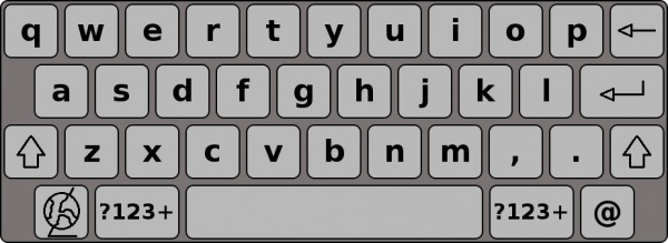
The main keyset you will see when the keyboard appears is the one with lower-case letters. This uses the QWERTY-layout, as most people are familiar with that type of layout. This is considered to be the default layout.

Fig.2.1: The keyboard in its default (lower case) keyset
Shift/Caps-lock
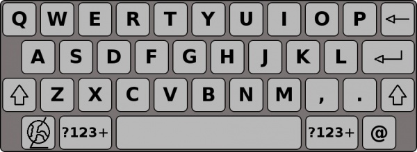
If you touch either of the shift-buttons (the buttons marked with an upward arrow) once, you will transform the lower-case letters into upper-case letters until you press a key. The upper-case letter will be entered into the text area and the keys will return to their lower-case state.
If you double-touch the shift keys, you will activate caps-lock. The keys will stay upper-case until you turn it off by touching either of the shift buttons once.

Fig.2.2: The upper case keyset
Numbers and symbols
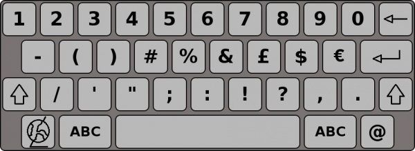
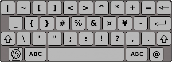
If you touch either of the buttons marked “?123+” once, the keyboard layout will change to display the numbers 0 to 9 and a variety of symbols. While this layout is active, touching the shift buttons will toggle the keyboard layout to display even more symbols. Touching the button marked “ABC” will change it back to the standard letter layout.

Fig.2.3: The numbers keyset with a few frequently used symbols

Fig.2.4: The symbols keyset shown when you press shift while the numbers keyset is active
