KDE Project History/KDE Three Beta (Developer Meeting)
KDE Three Beta in Trysil, Norway: Part 1
Pre KDE 2.0 Progress Report

Sorry, Konqi the KDE dragon is busy working very hard on the next release, but Katie his girlfriend is here to tell you what's going on.
A lot has happened with KDE since the last beta. The developers have been extra productive, thanks mostly to having the opportunity to work together face-to-face. For ten days a collection of core KDE developers met in Trysil, Norway. The main purpose of the meeting was to fix as many KDE 2 bugs as possible and to make any important changes in functionality, appearance, and behaviour.
The feedback from the early betas of KDE 2.0 has been incredible. Bug reports don't sound very pleasant, but there's nothing developers like better. Thanks to the efforts of all those who have tested previous betas, KDE 2.0 is now more stable, efficient, coherent and consistent than ever before.
To all those who contributed bug reports, we extend great thanks. KDE works as a project only when each aspect of the system is supported. The developers write software so quickly they don't have time to find all the bugs, so contributions are invaluable.
Note to those who reported bug(s): If your bug was closed but the developer responsible did not send you a personal message, we apologise. The time we have had recently to work together we have had to use wisely and getting the bugs fixed first has been top priority. If you want further information from a developer, please get in contact and we will do our best to find time to help.
Listing all the fixes that have been made since the last beta on this page would be dull, so instead we present a summary of changes that may interest the user and a few (important) notes for developers. Rest assured that we have worked most on improving stability, so if the list of changes presented here doesn't impress, you should find that the improvements in stability are reason enough to upgrade. No-one likes working at a desk with wobbly legs!
The desktop in general
The first thing you will notice when you start the new KDE is that you will get extra feedback, showing you what KDE is doing as it starts up.
The overall look has changed slightly. After some consideration, we changed the default colours and made minor adjustments to the way controls look. Screenshot showing new KDE look We hope you will agree that the new look is fresher and easier on the eye, but of course KDE is highly configurable, so feel free to exercise your right to disagree!
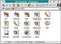
The new window controls should be not only easier to see but also more consistent and attractive. A nice new feature is that when a window is not active its contrast is reduced This makes it easier to see which is the active window.
You might notice that our Unicode (international text) support has been further improved. Window title bars now show Unicode text correctly. The whole window border design has changed considerably. The new style is prettier, faster and easier to use.

As those of you who used KDE 1 should remember, it was possible to move the menu bar of all applications to the top of the screen. While this may not seem very useful, it's designed to make it easier to work and to save some desktop space (you only have one menu bar instead of one per window.) To test it out, try moving the mouse to the menu at the top of a window. If you're not a good shot with the pointer, you have to adjust your aim. With the menu bar at the top of the screen, you can 'throw' the pointer to the top and be sure to hit the menu bar every time. This feature is configurable via the control centre.
When you move the mouse pointer into a text editing control and start typing, the mouse pointer now disappears until you touch the mouse again. This stops the pointer getting of the way of what you type.
Anyone who has a large monitor or less than 20/20 vision will welcome the addition of a set of larger mouse pointers.
All applications that use tool bars are enhanced by an improved mechanism for layout.

When there is no room to show the entire bar at once, it shows a pop-up menu at one end. This helps most on KOffice applications such as KWord, where your screen can rapidly fill up with tool bars.
If you are used to using one of the extra mouse-focus settings (where windows are activated by moving the pointer over them rather than clicking) then you will be pleased to hear that some extra features have been provided that make these modes easier to use and more configurable.
There is now a single point of configuration for all system notifications. This means that you can turn on and off sounds, choose to see pop up messages instead of sounds, etc. This feature is great if you are deaf or prefer to have a quiet computer (or simply can't hear your computer's sounds over your music!)
Drag and drop functionality has been extended. Where you expect to be able to drag something, it's quite likely you now can.
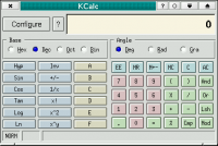
You can select a wallpaper image by dragging pictures from the Konqueror web browser directly to the desktop. You can set the colours of the buttons of your calculator. Just try it and see!
There is now a new international keyboard manager. This sits in the 'system tray' (a place for applications to 'dock' in the panel.) and is based on the 'XKB' standard.
FreeBSD users will be pleased to hear that extensive platform-specific fixes have been carried out and that KDE 2 works almost without (FreeBSD-related-) problems.
Applications now start faster. More intelligent design of startup sequences reduces the time needed before you get to start using the program.
The desktop panel ("Kicker")
The clock has been reworked and sports a stylish new LCD-style face.

Of course, the look can be configured to your heart's content.
The utility named 'Klipper' has been moved to the base package. It appears on the panel 'system tray', represented by a picture of a clipboard. This excellent little tool watches your desktop and whenever you select some text, it will save it for you.

This means that you can go back and find that email address you selected but never got around to saving, but Klipper is a little more intelligent than that. It notices when you select an Internet address, and will quietly ask you if you would like it to browse to a site for you.
The desktop pager has been cleaned up and given life. It can show your desktops by number or name, or by showing a miniature picture of the screen.

You can set the number of desktops too, for those people who can cope with working on sixteen virtual screens.
Your task bar doesn't look much more exciting than usual, but notice that when your modify a document in a KDE application, the task bar button shows an indicator to remind you (together with the window title changing to include the word '[modified]').

This can be highly useful when you're shutting down and need to see in which applications you still need to save your work.
You will also see another new 'applet' (or mini-program, running inside the panel.)

This allows you to type commands, in practically the same way as the dialog that pops up when you type Alt-F2. It's not just for command line freaks. If you're a faster typer than a mouse clicker, you will find you can start your applications faster and open web sites with less energy-wasting hand movement.
The icons on the panel have a new addition, which allows you to show the desktop background on top of all your windows. Quite handy when you have dropped a file onto the desktop and want to read it, but don't want to sort through a stack of windows.
In the last beta, you might have noticed that you could add icons to your panel by dragging them from the 'K' menu. This has been extended to allow dragging a whole 'group'. To avoid sticky situations, this function has been moved to the right mouse button. You can choose whether to add the group to the panel as a file manager URL, which opens a Konqueror window to display the group contents, or as a 'Quick browser', which uses a menu.

Your 'K' menu has another new feature. It can be edited to contain anything you like. Don't like the default ordering of items ? Fancy some better icons for your applications ? Fire up the new menu editor (available in the 'System' menu) and drag some entries about.
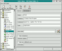
Other enhancements to the panel include extended configurability and a feature that allows you to select which 'applets' you trust to run inside it. If you download a new applet and it crashes, taking the panel with it, you can tell the panel to stop trusting it, which means the applet will only be able crash itself in future!
The file manager and web browser ("Konqueror")
In file manager mode, you will notice a new set of icons, designed to be easier to recognise and easier on the eye. When you activate an icon (by clicking it) you get instant feedback via a tiny animation (you have to see this in action to understand how useful it is).

If the click launches an application, a button appears in the desktop task bar immediately. If the application takes time to start up, you at least know that it is on its way. These features also apply to the rest of KDE, for consistency.
For those who find themselves annoyed by web sites that use tiny, unreadable text, you should be pleased to hear that you can now set a minimum size for text when you browse web pages.
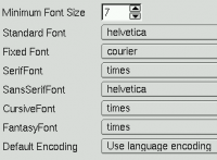
You can also set the text styles used for each type of text that a web page may specify.
Web browsing should now be smoother and pages should be drawn a lot more quickly. Badly drawn pages should be drawn better and be less likely to cause a crash.
A brief security audit has been made, to catch any potential weaknesses before release.
Last but not least for Konqueror, Java applet embedding support is now working. This should fix a lot of web pages and improve playing Internet-based games.
You can now browse an archive (tar file, even compressed ones) in Konqueror. You can extract files by simply dragging them elsewhere. You can even enable the 'image preview' mode !
It's now a lot easier to associate applications with file types. For example, if you want to view PNG images with XV instead of within Konqueror itself, you can right-click on a PNG file, select "Edit File Type" and pick "XV" from the graphics section.
Applications
A new application named KSysGuard has been integrated into the base system. KSysGuard gives you complete control over the programs you are running, and provides useful statistics to help you discover what is going on 'behind the scenes'. For those with a taste for power, you can even ask KSysGuard to monitor and allow you to control a machine running at another location, via the Internet. Displays can be freely configured on any number of worksheets by simply dragging them from the sensor browser onto a worksheet. Worksheets can be individually saved and loaded and will be restored automatically when ksysguard is launched.

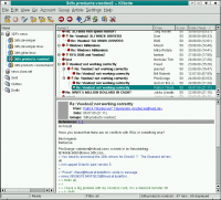
A new news reader named KNode has been maturing rapidly and officially replaces in the network package the two readers included with KDE 1, which are both no longer maintained by their authors, in the network package. KNode makes a great companion to the system news manager called leafnode. It has a beautiful user interface, makes full use of the new features of KDE 2, is feature packed, and even manages to pass much of "The Good Netkeeping Seal of Approval" test.
KWrite, the standard KDE text editor, is now network transparent. This means you can drop a text document onto its window from Konqueror and it will be loaded automatically,
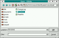
in exactly the same way as if you had dropped a file from your hard disk. Of course, saving works the same way, but you need permission to save to other people's machines, so don't expect to be able to save to www.kde.org!
The two mail monitor applications from KDE 1 have merged into one. The new version has the features of both and an improved look and feel.

The Control Center modules have been much improved. The layout of many modules has been made more logical. Keyboard navigation has been enhanced. Many modules have new features. The place in which you configure certain values has been rethought, so you should find the option you want in the place you expect to find it. The help is also greatly improved. There is 'quick help' for many items, which allows you to find out what a switch, slider etc. does before using it.
KMail's support for the standard kde address book library (libkab) was finished. Choice from a variety of different address book GUIs is implemented. In KMail's "Configuration" dialog, in the section "Appearance", the tab "Addressbook" lets user select between traditional kmail addressbook, kdeutils/kab and kdepim/abbrowser.
ABBrowser, the addressbook browser part of the kdepim package, is a new addressbook application chosen to be ready for inclusion in KDE-2.0. It makes use of libkab (the central KDE addressbook library) as a backend, has unlimited undo/redo, and exciting Drag'N'Drop functionality amongst other features.
KOffice, the KDE office suite
KSpread, the KOffice spreadsheet application, has undergone some major internal work. Spreadsheets should now flicker less, memory consumption has dropped, and the whole application is faster. There are new formulae available, together with documentation on how to use them. Multi-row cells work correctly now. Another new feature is that KSpread can now perform calculations using times and dates.
KPresenter, the KOffice presentations application, has a new 'rich text' editing facility. This powerful feature makes it easy to change the way that text looks and see the results as you type! The text selection mechanism has been much improved and indentation is more powerful. Now you can even use rotated text!
KIllustrator, the drawing tool, has now been converted to the new KOffice architecture, which makes it more consistent in use, and is much improved in many areas.
KChart, the charting tool that accompanies the office suite, is much improved. It offers a larger selection of chart types, together with a 'wizard' to guide you through the steps needed to create a chart.
Printing has been generally improved. The main advantage you will see is that you can now print a document which is embedded within another.
Development information
Most memory leaks in the KDE libraries have been tracked down and fixed, with the help of a professional memory debugging tool.
A new set of DCOP tools have has been written that allow you to inspect and use the interface of an object belonging to another application.
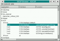
There is a graphical tool and a shell tool for DCOP. You can probably see how the graphical tool works, so here's some examples with the shell tool. See if you can guess what they do !
   * dcop konqueror qt/.*mainwindow#1 iconify
   * dcop konqueror qt/.*mainwindow#1 show
   * dcop kdesktop KBackgroundIface setWallpaper mywallpaper.png 4
   * dcop konqueror KonquerorIface openBrowserWindow http://www.kde.org
Signals and slots now work over application boundaries via DCOP!
The KOffice core libraries have been extensively cleaned up. The old custom-written XML parser has been removed and replaced with calls to Qt's built-in DOM parser. The file format used by KPresenter has been cleaned up to make it easier to work with. It is of course backward compatible with the old format. KSpread uses a new advanced system for runtime cell referencing, making it orders of magnitude faster and use much less memory.
KWrite has been ported to the new KDE 2.0 style for applications, using the XMLGUI application framework and is now translatable. This editor is an important component of the system so developers should feel more confident in its suitability as a standard editor part.
Credits
"Katie the Dragonesse" image by Agnieszka Czajkowska
Contents of this document authored by Rik Hemsley, member of KDE Team.
Thanks for contents contributions to Don Sanders and Chris Schläger.
Screenshots as well as fixes and audit of contents by KDE Team.
Many improvements and bug fixes of KDE 2 source code were performed during the KDE-Three Beta reunion in Trysil, Norway. Many thanks go to the sponsors that made this great KDE development event possible:
   * Troll Tech and SuSE Inc. funded lodging, hardware, Internet connections, part of travel expenses and many other.
   * Travel was also sponsored by Caldera and Mandrake Linux.
   * Klarälvdalens Datakonsult AB provided part of travel fees as well as meat and sausages.
KDE Three Beta in Trysil, Norway: Part 2
New and old clothes for KDE
If you have had the opportunity of using a recent KDE2 beta, you may know that KDE2 has supported widget themes for quite a while now. You may have noticed that these themes are fast. Really fast. And even those themes using pixmaps and gradients run at a decent speed, thanks mostly to Qt's excellent theming-engine and our optimized pixmap storage and cache mechanism.
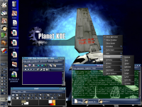
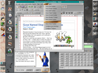
In addition to native KDE2 themes, we are pleased to announce that KDE now supports pixmap GTK themes. For importing a GTK theme into KDE, you just need to use the 'klegacyimport' wizard, available as a little standalone GUI application. However, while GTK themes are displayed faster and more efficiently than even native GTK itself, we do not recommend using this format for creating new themes. Theme developers should prefer KDE2's native widget theming which yields superior results both in terms of quality and speed. A nice HowTo and some documentation on KDE2 theming is available here.
One of the central commands of KDE is unification of the desktop experience. In respect for this, the excellent mechanism of KDE look propagation to non-KDE apps was recently extended so that GTK+ based applications be also taken into account. As a consequence, when the user chooses to export KDE look to external applications, not only compliant xrdb applications (like those using the Motif toolkit) or pure Qt applications will obey, but all applications that use GTK+ will display KDE's color schemes and fonts.
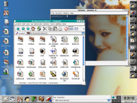
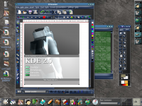
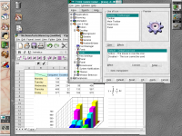
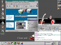
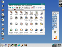
For the curious, here are some screenshots of KDE2 using GTK themes:
I Con Do It -- Icons in KDE 2
In KDE2, icons are themable as well. A nice application of this feature can be seen if you start KDE2 on an 8-bit color display. In this case, KDE will automatically default to a carefully crafted icon theme based on a 40-color palette: 216 extra colors are left for the more color-greedy applications. Of course, on a true color display, you would get the hi-color icon theme.
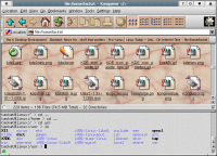
The size of the icons can also be easily changed. Just right-click on the toolbar handle, and you'll find a menu with a selection of various icon sizes. Or change the icon size in other locations or globally from the KDE Control Center. This way you can make optimal use of your desktop space and monitor:
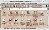
Also notable are the various icon effects. These include levels of greyscaling, highlighting, colorization, saturation/hue, semitransparency... and the ability to customize the behavior and appearance of the icons in all the various states (MouseOver, default, disabled) and locations (desktop, toolbars, menus, panel).
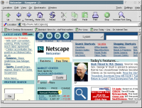
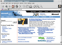
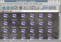
In fact, if you are creative enough, you can do such things as make Konqueror look like Netscape. Or Internet Explorer. Or make it look like something entirely different. We tried our hand at it:
Else
While these are aesthetic features, they can also be quite important from a usability point of view. For example, if you are an artist or graphic designer, you may not want your icons to look too colorful. In fact, if at all possible, you'd want to work in a color-neutral environment. Well, with KDE2, you can switch all your icons to grey quite easily - and if you want a colorful desktop to impress your friends, it is just a click away!
