PIM/Akonadi/Logo: Difference between revisions
*>Jfeby No edit summary |
*>Astan (Helping James with the upload of a preview of his contest entry) |
||
| Line 51: | Line 51: | ||
'''Description:''' I started with the idea in the announcement (A as the bottom of the K), but then moved the K so that the bottom leg was in line with the right side of the A. My A looked pretty good, but just that chilling with the k wasn't really enough to enter into a contest. I wanted to reflect the "under-the-hood" nature of Akonadi, and in so differentiate from a PIM Suite or a database app. I started throwing gears on there, but then it just looked like the KDE logo with a big A. So, after meditating on my big A, I began to see a [http://en.wikipedia.org/wiki/Reuleaux_triangle Reuleaux triangle] emerge, more specifically a [http://en.wikipedia.org/wiki/Wankel_engine Wankel engine]. So I executed the concept visually, and this is the result.<br/> | '''Description:''' I started with the idea in the announcement (A as the bottom of the K), but then moved the K so that the bottom leg was in line with the right side of the A. My A looked pretty good, but just that chilling with the k wasn't really enough to enter into a contest. I wanted to reflect the "under-the-hood" nature of Akonadi, and in so differentiate from a PIM Suite or a database app. I started throwing gears on there, but then it just looked like the KDE logo with a big A. So, after meditating on my big A, I began to see a [http://en.wikipedia.org/wiki/Reuleaux_triangle Reuleaux triangle] emerge, more specifically a [http://en.wikipedia.org/wiki/Wankel_engine Wankel engine]. So I executed the concept visually, and this is the result.<br/> | ||
'''Link(s):''' [http://www.unc.edu/~jfeby/files/akonadi.png PNG] | [http://www.unc.edu/~jfeby/files/akonadi.svg Inkscape SVG]<br/> | '''Link(s):''' [http://www.unc.edu/~jfeby/files/akonadi.png PNG] | [http://www.unc.edu/~jfeby/files/akonadi.svg Inkscape SVG]<br/> | ||
'''Preview:'''<br/> | '''Preview:'''<br/>[[Image:akonadi_logo_james_eby.png]]<br/> | ||
Revision as of 21:42, 28 April 2008
Welcome to the Akonadi Logo contest. This is the place where you can add your logo. The Akonadi developers will decide which logo they like most and use that on the website, for Akonadi applications, etc. Be creative!
The winner will not only become famous instantly, but he (or she) will also receive a brand new (though dated) Canon Powershot digital camera kindly provided by KDAB !!!
Name: Aron Stansvik <elvstone at gmail.com>
Description: I liked Sune's idea and made my own variation :) Colors can of course be tuned/discussed/skipped all together :) Below is blue, red and lime from Oxygen palette. This is a logo and not an icon.
Link(s): PNG | Inkscape SVG
Preview: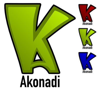
Name: Flo <flo at vdecine.net>
Description: Inspired by the Akonadi architecture :)
Link(s): PNG | Inkscape SVG
Preview:
Name: Nuno <Nuno at oxygen-icons.org>
Description: The idea revolves about the classical sound of akonady the pim meaning human side of it, and the ribbon that can float your human side around in the wind/world, Maybe the monochrome version can also be made using the outer shapes of the face masked out towards the right, and not how it looks now :) yeah its a Nvidia logo didt saw that wen making it.
Link(s): PNG | Inkscape SVG
Preview:
Name: ben <benadler at gmx.net>
Description: Inspired by Flo AND Nuno *g*
Wow, I managed to rip, rape and loot the work of two other submitters :) I didn't like Flo's colors and the gears. And instead of bitching about it... I think the mail icon looks better, but akonadi isn't just mail... Oh, and the outer borders are a little thicker, so it looks better when used as a small icon.
Link(s): Inkscape SVG
Preview:
Preview:
Name: Michael H. <mhowell123 at gmail.com>
Description: Inspired by previous entries and the Konqueror icon.
SVG: 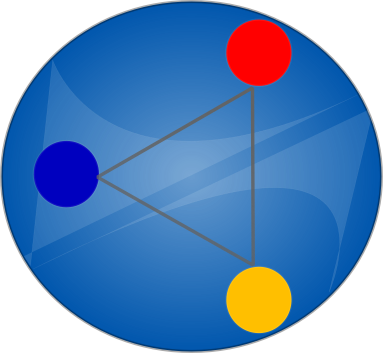
PNG: 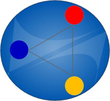
Name: Aron Stansvik <elvstone at gmail.com>
Description: I also took a stab at the architecture + head idea. Head stolen from Nuno. If you take this, send the camera to Nuno as I don't need it, just want to help and my attempts at a head looked crappy :) I think minus the text and with some work, this could also work as a system tray icon.
Link(s): PNG | Inkscape SVG
Preview:
Name: James F. Eby <thejames at unc.edu>
Description: I started with the idea in the announcement (A as the bottom of the K), but then moved the K so that the bottom leg was in line with the right side of the A. My A looked pretty good, but just that chilling with the k wasn't really enough to enter into a contest. I wanted to reflect the "under-the-hood" nature of Akonadi, and in so differentiate from a PIM Suite or a database app. I started throwing gears on there, but then it just looked like the KDE logo with a big A. So, after meditating on my big A, I began to see a Reuleaux triangle emerge, more specifically a Wankel engine. So I executed the concept visually, and this is the result.
Link(s): PNG | Inkscape SVG
Preview: