KDE Visual Design Group/Muon Discover: Difference between revisions
| Line 74: | Line 74: | ||
*[https://techbase.kde.org/Projects/Usability/HIG/Patterns/CommandPatterns#Patterns_for_a_simple_command_structure Command pattern for a simple command structure]: Started with '''Menu Button + Direct manipulation of content'''. Ended up with '''Menu Button + Toolbar''' | *[https://techbase.kde.org/Projects/Usability/HIG/Patterns/CommandPatterns#Patterns_for_a_simple_command_structure Command pattern for a simple command structure]: Started with '''Menu Button + Direct manipulation of content'''. Ended up with '''Menu Button + Toolbar''' | ||
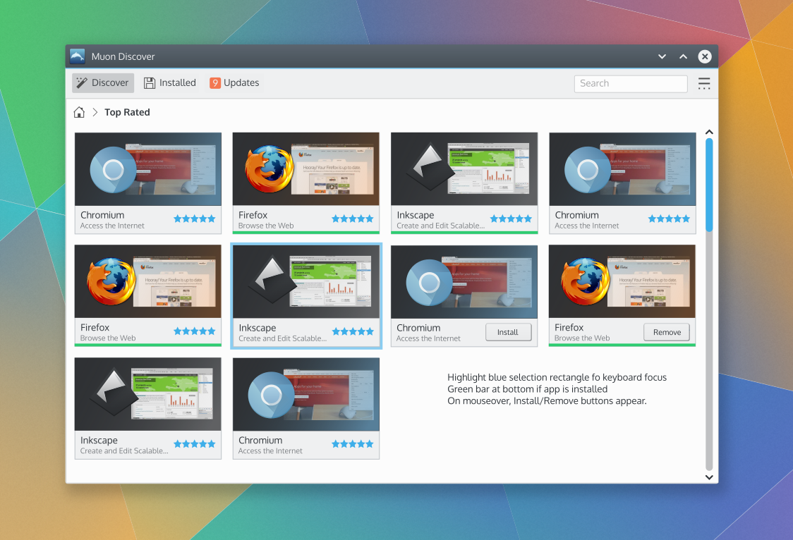
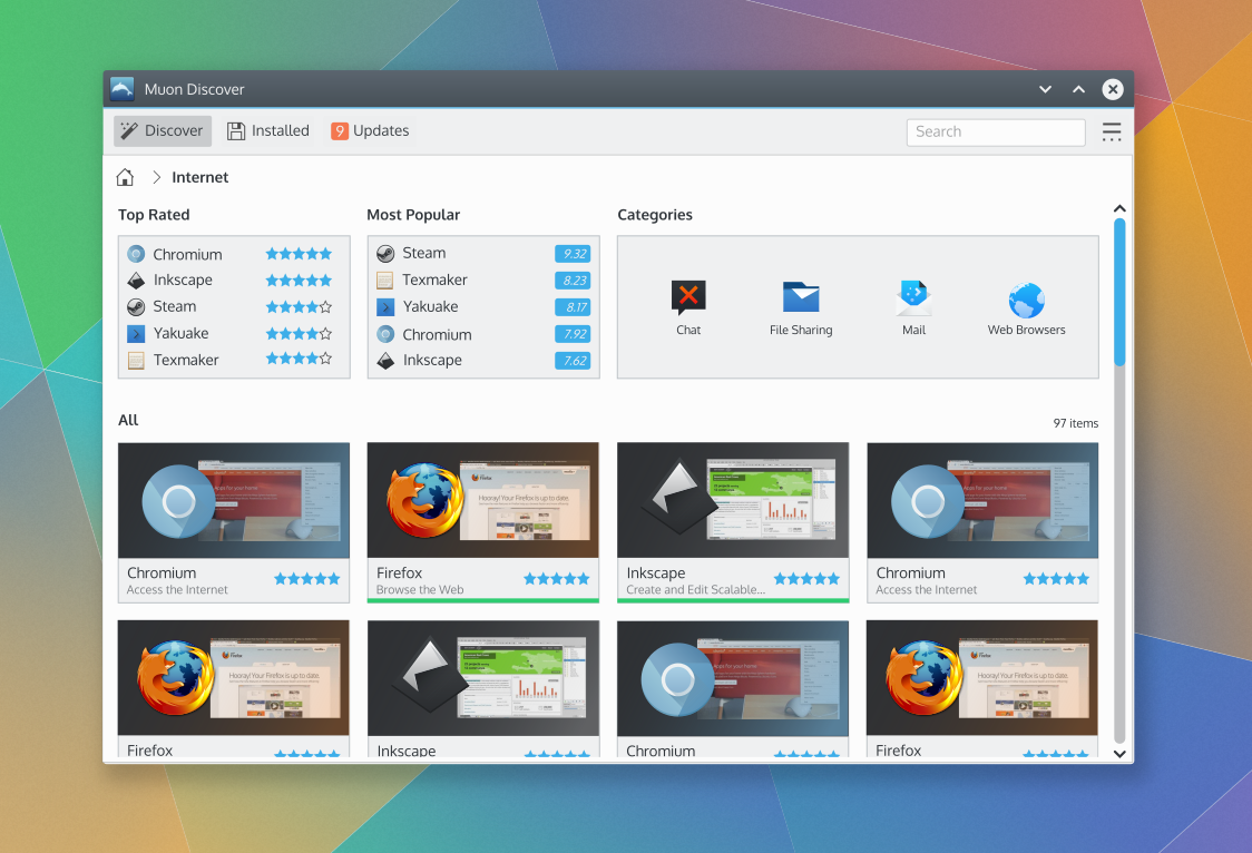
*[https://techbase.kde.org/Projects/Usability/HIG/Patterns/NavigationPatterns#Patterns_for_a_3-deep_content_structure Navigation pattern for a 3-deep content structure]: | *We started with [https://techbase.kde.org/Projects/Usability/HIG/Patterns/NavigationPatterns#Patterns_for_a_3-deep_content_structure Navigation pattern for a 3-deep content structure]: Original design had a '''List-Detail List''' combination pattern. After some discussion, it was decided to use a [https://techbase.kde.org/Projects/Usability/HIG/Patterns/NavigationPatterns#Patterns_for_n-deep_content_structures Breadcrumb-Drilldown Grid] for category browsing. Similar to the original Muon design as the foundation for content navigation. It provides more space for to display content and provide breathing room and provides a nice evolution from the current design. The "Back" navigation button was avoided to keep the user from having to mentally accommodate a history-based navigation model on top of the necessary content-structure-based navigation model. | ||
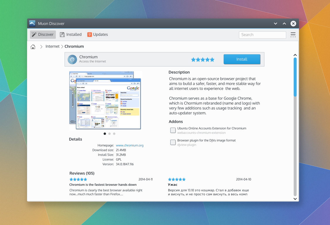
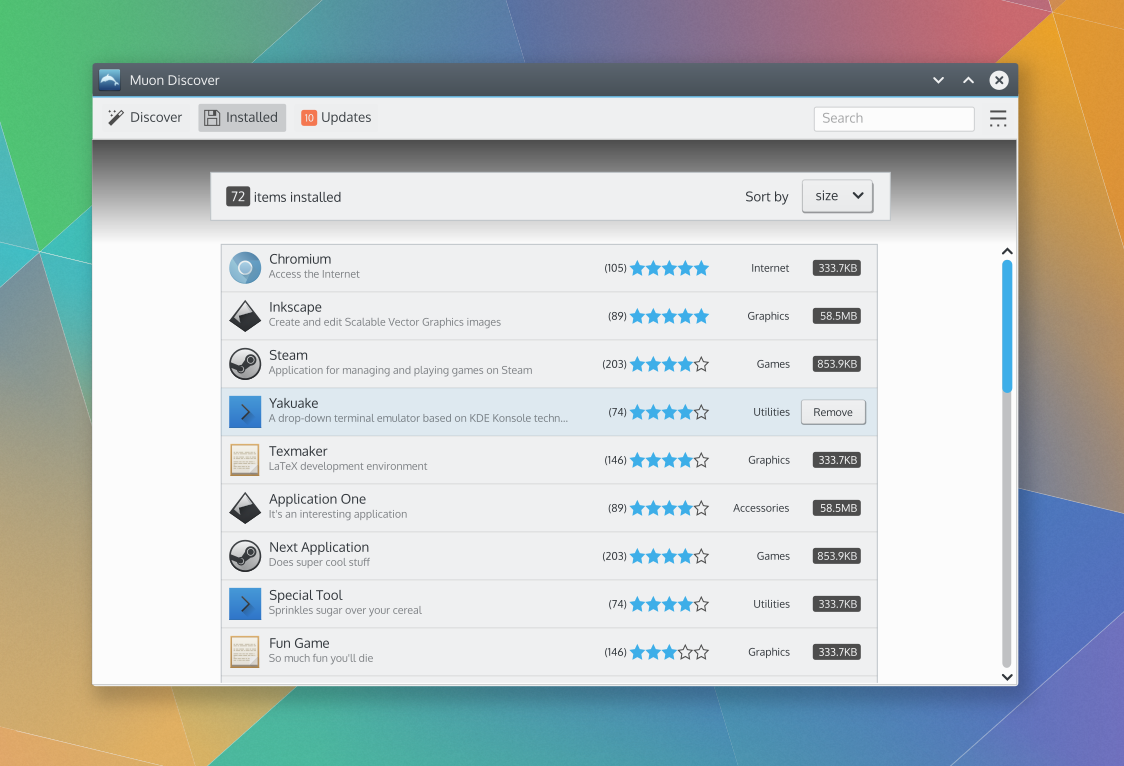
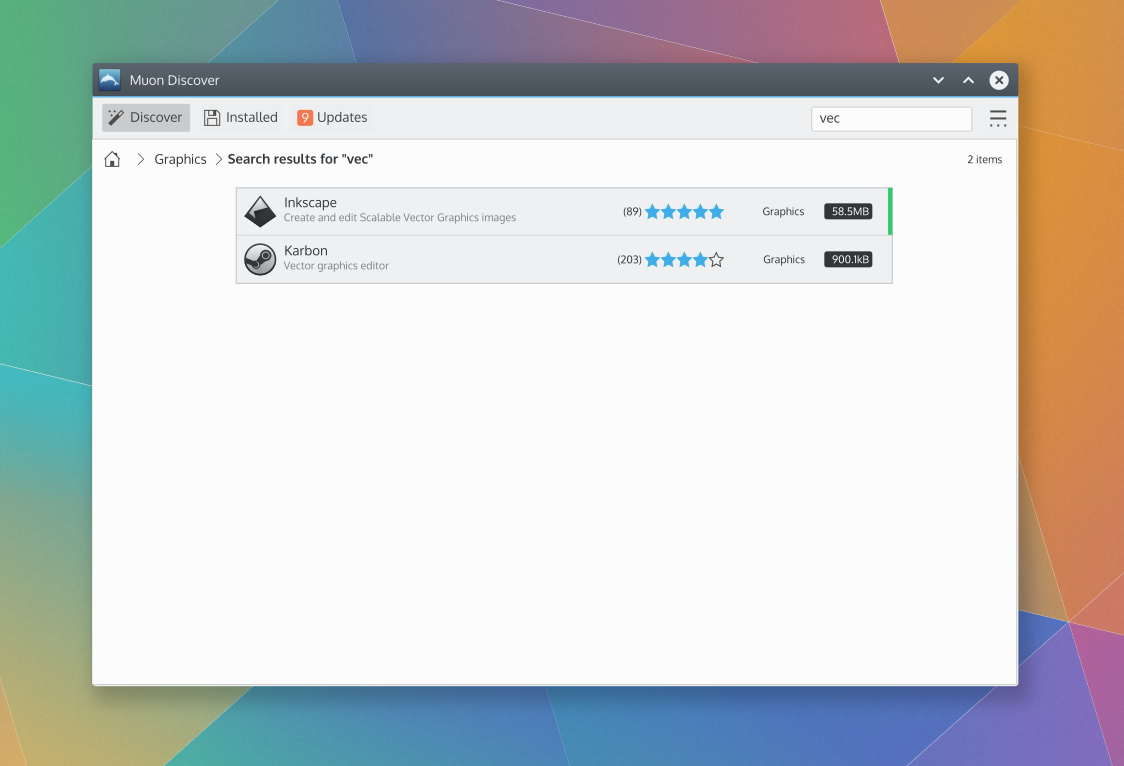
*A common visual language is use to represent an application/item - an icon, title, subtitle, rating, etc. on a consistent background with some variation of a green line indicating when an item is already installed. The same visual language is employed for application/item design in the grid layout, the list layout and the header of the application/item details layout. | |||
==Layout Design== | ==Layout Design== | ||
Revision as of 17:40, 5 September 2015
Concept
See KDE HIG for guidelines on this design approach.
Muon Discover Vision
Haven’t you ever found a tool that was perfect for your need but you only found it after some time stumbling upon it on the net? When considering to install an application, don’t you wonder sometimes if it’s really worth it? Or if it’s actually what you’re looking for?
Muon Discover helps users easily and quickly find applications or tools. By allowing to navigate a software library by search, software categories, top 5 lists along with detailed application information that includes screenshots and reviews, users can more quickly find applications that suit their needs.
Furthermore, Muon Discover will let you manage the different sources of software you have and manage the applications you’ve already installed in the past but you don’t want anymore.
Personas
(Selected from the pre-defined KDE personas)
- Susan, 34, Recreational user. While Susan seldom uses her computer for work, it has become an essential part of her social life. With her computer, she can be creative and spread this creativity in the world. She chats with her friends, shares music, playlists and other media, creates videos and uploads them to her web space, and runs a blog with her own style. She can't imagine a life without her laptop. Still, she is a fun person and does not want to worry about technical details. She expects her machine to work.
- Santiago, 34, Decision Maker. Santiago runs a medium-sized business for electric installations. For him, technology needs to be comfortable and make him feel smart. As a manager with engineering background, Santiago's major work is to negotiate with customers. However, to avoid costs, he administrates the small network in the company himself, including a file server and fifteen PCs for his office clerks. He loves comfort and does not like to dive into manuals or use the command line to set up the small network. The system has to be reliable and easy to use, so his employees get along with it.
Scenarios
- Susan learned about an image editing application in her art circle. She would like to use the application to edit images for her blog so she asks for the name of the application. When she gets home Susan opens Muon Discover on her computer, searches for the application by name and installs it. Once installed she opens the application and starts using it to edit a few images for her blog.
- Same scenario as above, but Susan forgets the exact name of the application by the time she gets home. But she does remember it was an image editing application. She opens Muon Discover and browses the application categories and sub categories. She recognizes the name of the application in Graphics category, Painting and Editing subcategory and installs it. Once installed she opens the application and starts using it.
- Susan receives an email from a friend with a MS word document attached. When she attempts to open the attachment she discovers that she doesn't have an application that can view the Word document. She opens Muon Discover and searches for "Word" which returns several results, one of which is LibreOffice. She installs LibreOffice then opens the Word document in LibreOffice to view it.
- Santiago is directed to reduce the IT budget, so he would like to eliminate some licensing costs of proprietary software. As part of that effort, he would like to evaluate different zero-cost office suite alternatives. The solution must have good compatibility with Microsoft Office file formats, the default file of the company's primary contractee while being easy to use to minimize any drop in productivity during the transition. He opens Muon Discover and browses the application categories and discovers LibreOffice and Caligra among the list applications. He reviews the application descriptions, ratings and reviews. He noted that Calligra got great reviews for the consistency and ease-of-use. He also saw the LibreOffice got lower ratings for ease-of-use, but several reviews mentioned it's great compatibility with Microsoft Office formats - important for the business needs of the company. He decides to install LibreOffice and starts evaluating it. He's happy with LibreOffice, and selects it to be the default office suite for his company.
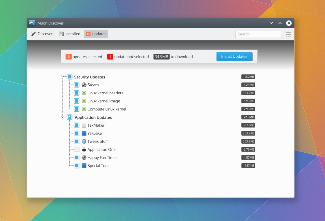
- Several security vulnerabilities were fixed in some of the applications Santiago uses on his computer. Muon Discover notifies Santiago that security updates are available the same day that fixes are released in the application repositories. Santiago opens Muon Discover and installs the security updates. Santiago's computer is now up-to-date and is no longer susceptible to any known vulnerabilities for which a fix is available in the application repositories.
- On her favorite website Susan reads about updates to her favorite video editing application, Kdenlive, that just became available for her computer this morning. The update fixes a bug in a feature she uses frequently when editing videos for her blog. Her computer is set to update weekly so it hasn't notified her about the updates yet. So she opens Muon Discover. She clicks refresh to see if the updates are available for her to install. After the refresh Muon Discover shows that the updates for Kdenlive are indeed available. Susan installs the updates for Kdenlive then opens it to see if the bug was indeed fixed, which it is. She edits the videos for her blog without encountering the bug.
- Santiago is an avid Google user and would like use the latest version of Google Chrome for all his browsing needs but it is not installed on is computer. He opens Muon Discover and is unable to find Google Chrome. So he goes to google.com and searches for "Chrome". He clicks the first return which takes him to the Google Chrome page where he is offered the option of downloading Google Chrome. The notes mentions that it will add the Google repository to his software repositiories. He clicks the download link and Muon Discover opens and installs Google Chrome from the Google repository. Santiago opens and uses Google Chrome.
- Susan would like to freshen up her computing experience so she decides to change the icons. She opens Muon Discover and browses the categories looking for icon themes. She finds a category with icon themes and a few highly rated icon themes. She installs one that she likes and freshens up her workspace.
- Santiago needs to recover some disk space for a collection of large files he needs to download, so he decides to remove some applications he is no longer using. He opens Muon Discover and browses the installed applications. He remove several applications he now longer uses, successfully freeing up disk space. He proceeds to download the large collection of files.
Organization
Command Structure
The essential commands are:
- Search for applications
- Install one or more applications
- Remove one or more applications
- Install system or application updates - most frequently used
- Add/Edit/Remove software repositories - least frequently used
- Refresh software repositories
This meets the criteria for a simple command structure.
Content Structure
There are two collections of content: the software library and the collection of software repositories.
Software Library
- Application/Item Name
- Category
- Sub-Category
- Installed Version
- Available Version
- Release date
- Screenshots/Video
- Reviews
- Review Version
- Rating
- Review date
- Review title
- Review text
- Add ons
- package name
- description
The content may be applications (executable software) or other items (like wallpapers, icon themes, etc.) Applications/Items can be grouped by category and sub-category, by whether the application/item is installed or not, and by whether the application/item has updates or not. When grouped by category and subcategory, the software library content structure is at least 3-deep. When grouped by installed or updates-available, the content structure is at least 2-deep.
Software repository collection
- Name
- Repository url
- Category
- Target OS version
- Source/Binary
- Enabled/Disabled
Software repositories can be grouped by categor. When grouped, the software repositories are 2-deep.
UI Patterns
- Command pattern for a simple command structure: Started with Menu Button + Direct manipulation of content. Ended up with Menu Button + Toolbar
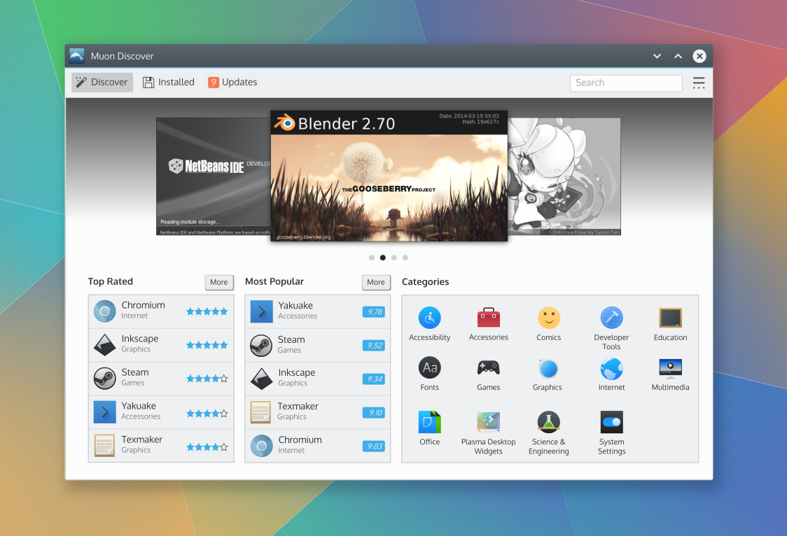
- We started with Navigation pattern for a 3-deep content structure: Original design had a List-Detail List combination pattern. After some discussion, it was decided to use a Breadcrumb-Drilldown Grid for category browsing. Similar to the original Muon design as the foundation for content navigation. It provides more space for to display content and provide breathing room and provides a nice evolution from the current design. The "Back" navigation button was avoided to keep the user from having to mentally accommodate a history-based navigation model on top of the necessary content-structure-based navigation model.
- A common visual language is use to represent an application/item - an icon, title, subtitle, rating, etc. on a consistent background with some variation of a green line indicating when an item is already installed. The same visual language is employed for application/item design in the grid layout, the list layout and the header of the application/item details layout.
Layout Design
Current design after developer feedback:
Old mockups
Mockup raw assets
The mockup file(s) containing everything shown in the layout design is available here: share.kde.org

