RKWard: Difference between revisions
| Line 184: | Line 184: | ||
[[File:WarnBeforeVariablePicker.png]] | [[File:WarnBeforeVariablePicker.png]] | ||
The mockup shows the mere concept; it is not meant to be a great design (the font of the warning is too small, the warning sign is hard to see and in its repetition possibly cluttering. It is not too hard to fix though) | |||
=== Workspace === | === Workspace === | ||
==== Basic Design ==== | ==== Basic Design ==== | ||
{{Note|''This is obsolete now, I think. The Workspace has a new UI that incorporates many of the suggestions here (11/15)'' --[[User:Jand|Jand]] ([[User talk:Jand|talk]]) 10:00, 13 November 2015 (UTC)}} | {{Note|''This is obsolete now, I think. The Workspace has a new UI that incorporates many of the suggestions here (11/15)'' --[[User:Jand|Jand]] ([[User talk:Jand|talk]]) 10:00, 13 November 2015 (UTC)}} | ||
Revision as of 13:18, 22 November 2015
General info
The RKWard project is currently in the process of moving to KDE.org. See Incubator/Projects/Rkward. Current web site is still at Sourceforge.net: http://rkward.sf.net .
Feedback
This page is going to be a hub for RKWard related feedback and work-in-progress tracking. Might need subdividing over time.
Note that this is intended for things that may need discussing. Not for fully-specified feature requests. The latter should go to the tracker.
We're (mis-) using the \{\{Note\}\}-template to keep suggested solutions separate from the feedback.
Keep this page clean. Items that are done (or moved to the feature tracker) should be removed.
Installation issues
Mac OS X
As of 0.6.3, the dock icon, and the miniature icon in window title bars, still does not appear. This has been so since 0.6.1 at least. See example below.
The struggle I've run into with many Mac users is that they have to install R and then RKWard. It would be great if those could be bundled together again.
Windows
Abatty: With the Windows package, the issue is that it's just a .zip and you can run it from anywhere. People really aren't used to that, and they don't know how to add a shortcut to the Start menu/giant-useless-screen-with-live-advertisements.
- The standard installation seems to be an .exe – is the information above outdated, or is there a good reason of not using this installer? //Jan
Abatty: Also, many people are confused/freaked-out when a scary-looking black terminal window comes up upon starting it. The Windows package also seems pretty fragile. Most of the Windows students have tossed it and reinstalled it at least once. It's intermittent, and I haven't been able to reproduce it, but it just stops working at some point. The terminal window comes up, and that's all. I'd give you guys more information if I had it. Just generally speaking, the Windows version is not as reliable as the Mac, I'm finding.
R Console
Abatty: It would be great if there were a way to permanently set text size there, or at least have a keyboard shortcut to change it. It's tiny by default, and the only way to get it bigger is to keep going up to "View" and clicking "Enlarge font" over and over. Then upon restart of RKWard, it's back to tiny again. This is another teaching issue more than anything. If I need the students to do something in R, it's very hard to demonstrate without bumping that way up, but it takes forever as I keep going up to that menu over and over until I see the students stop squinting at the projector screen!
Plotting issues of various kinds
Abatty: I can't seem to figure out how to make a grouped barplot out of the Plots → Barplot dialog. I've been telling my students to do it via the "N to 1 Crosstabulation" dialog, where it works fine.
Abatty: A Q-Q/Normality plot in the Scatterplot dialog would be awesome. The only
place I can find that in RKWard seems to be one of the options in the
Scatterplot Matrix dialog.
Abatty: It would be very helpful if the Scatterplot pulled axis labels from the Label header, or, if empty, the variable name itself, for the variable by default. Right now you have to enter labels manually. This results in me getting a lot of test answers labeled "Xrange" and "Yrange," which I still give full marks for if they are obviously the right variables.
Outputs
Abatty: Exporting outputs is the area of the most confusion for my students. The only option for getting things out of the output is to export the entire giant HTML file, which still just pulls graphics from the invisible .rkward directory. To get a histogram out to submit for my test (I give tests with Moodle), the process is:
  1. Export the output to HTML.
  2. Open the output in your browser.
  3. Locate the desired graphic on the giant page of everything you've
  ever done with the software ever, unless you've flushed the output, but you
  were afraid to do that so it's still there.
  4. Right-click the graphic and save it to a file.
  5. Upload it to Moodle.
Abatty: A big part of this, of course, is that RKWard is running KDE, not the host OS, really. But this is a lot of steps for an undergrad or not-terribly-savvy user to complete correctly. Every time I've taught with RKWard, whether it be to undergrads or colleagues, everyone gets lost here. They can see the graphic right there in front of them. They don't understand why they can't just export it directly from the output (they'd love to just drag it out, but I point out that even SPSS doesn't do this, and JMP is a pain, too).
Abatty: Even I, as a pretty confident user of RKWard, find this to be a massive PITA, and what I do is just navigate to the .rkward directory and keep it open as I work, sorted by date, and just copy stuff out of there as needed. But even when I show people this workaround, they invariably MOVE things out of that directory and then cry, "Where did it gooooooo???" the next time they open RKWard.
- Tfry: Not to say that this solves, everything, but dragging out graphics (to file browser, or openoffice) works just fine, here. What are the symptoms on Mac, when you try to do so? - Do you see a drag symbol / mouse pointer at all? - Does the drag symbol disappear when leaving the RKWard window? - Does the target refuse to accept the drop?
Abatty: The whole system is extremely unwieldy and unintuitive, and what it means
is that I get a lot of screenshots of RKWard on the tests. Even of the
tabular outputs!
Abatty: This, I suspect, is a much bigger fix. What I would love to see, though, is that output HTML file and the associated images be in a folder with the workspace if saved, similar to how it works in SPSS, but less locked down and headache-inducing. So perhaps you open RKWard up to just play with some ideas, as I often do, and then opt to discard the workspace on close. While you're working on an unsaved workspace, the behavior is the same as now, but when you close it, the output files are also discarded. If you save the workspace, however, it creates a folder containing the R and RKWard workspace files, the same as now, but also a folder containing the outputs. Loading that workspace later will use that output folder instead. This solves the problem of an endless scroll of everything you've ever done with the software because if you even need one thing in there, you can't flush it, and makes it much easier to find things later. The current HTML-based output system is wonderful in that it can be opened in your browser and all the graphics files are already "exported" to PNG, but since they are locked away in an invisible directory, and necessarily chained to everything else you've ever done, it makes it very hard to get information out of it.
Abatty: Last comment about the outputs is one that has already come up here before: The tables are, by and large, very ugly. There needs to be more of a margin inside cells, and it would be nice if there were borders by default. Also, many of them have far, far too many decimal places. The contingency table/crosstabs are the worst for this. If any of the values need decimal places, they all get them. So even though most of the cells are actually just counts/sums, they all have approximately one million zeros behind them. It's just very hard to read.
Import
CSV: Call the file selector
Before any option makes any sense, the file needs to be loaded. So flow-wise it would make sense to open the file picker right away. It also would match user expectations, since it is standard in many other applications.
Data Picker
Position in Plugins
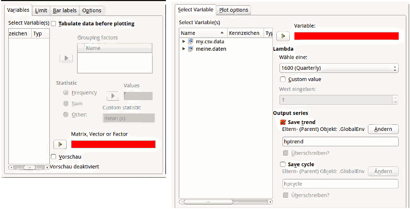
The data picker target (the field you "put" the selected value from the list of data objects in) belongs function-wise to the list of data items and the green "put it there" button(s). Because of constraint space it is often placed on top or below other options. In this (frequent) case, it (visually) groups with the other (not directly data-picker-related) options, rather then the data picker list and it’s button.
Possible Fix: A consistent position for the data picker target. It sometimes appears below- sometimes on top of other options. It would be great to have some coherence, since it would ease learning and make other (more complicated) fixes less needed.
The Data Picker Target is sometimes above, sometimes below other options (at least concerning plots, the positioning in analysis is more consistent
Type-Warnings
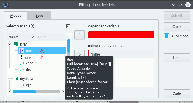
If a user uses a "wrong" value in the target field, the users sees a warning sign, which on hover reveals the reasons for not being able to process the variable (or at least the claim that it can’t)
The problem is, that we only get the warning after we added the variable. Here an imperfect solution, of how to make it clear beforehand which variables will work and which may cause problems:
The mockup shows the mere concept; it is not meant to be a great design (the font of the warning is too small, the warning sign is hard to see and in its repetition possibly cluttering. It is not too hard to fix though)


