KDE Visual Design Group/System Settings Application: Difference between revisions
| Line 24: | Line 24: | ||
==UI Patterns== | ==UI Patterns== | ||
Since almost the entirety of the function of the system settings application is to navigate or find the appropriate settings module, a simply menu button or toolbar + menu button command pattern seems sufficient. | |||
The navigation pattern chosen is a list+grid pattern to reveal the first two levels of the content structure, similar to the current system settings design. This is common with system settings applications across several platforms and may work well because it gives the user is given significant insight into the module hierarchy right away without requiring an interaction cycle. It also has the benefit of being a very recognizable pattern. As of this writing this pattern is not explicitly listed in the HIG, but it might be worth adding. | |||
==Layout Design== | ==Layout Design== | ||
Revision as of 20:56, 28 March 2015
Concept
See KDE HIG for guidelines on this design approach.
System Settings Vision
TBD
Personas
(Selected from the pre-defined KDE personas)
- Susan, 34, Recreational user. While Susan seldom uses her computer for work, it has become an essential part of her social life. With her computer, she can be creative and spread this creativity in the world. She chats with her friends, shares music, playlists and other media, creates videos and uploads them to her web space, and runs a blog with her own style. She can't imagine a life without her laptop. Still, she is a fun person and does not want to worry about technical details. She expects her machine to work.
Scenario
Organization
Command Structure
Two global commands: Search and Help
Content Structure
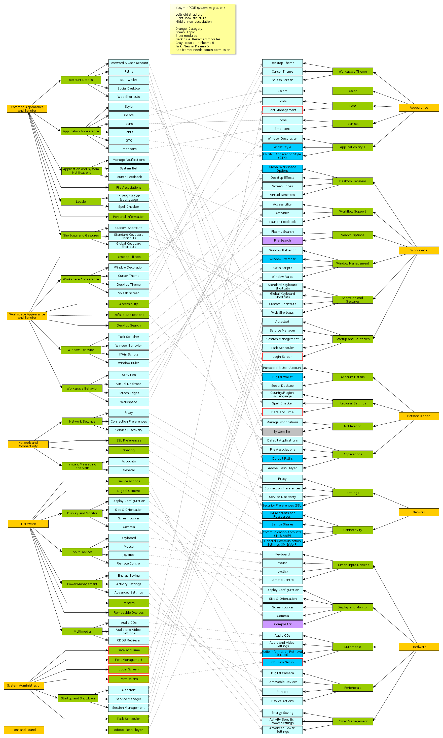
The forum discussion grouping the kcm modules is here: https://forum.kde.org/viewtopic.php?f=285&t=121053
The results of the grouping exercise is below:

UI Patterns
Since almost the entirety of the function of the system settings application is to navigate or find the appropriate settings module, a simply menu button or toolbar + menu button command pattern seems sufficient.
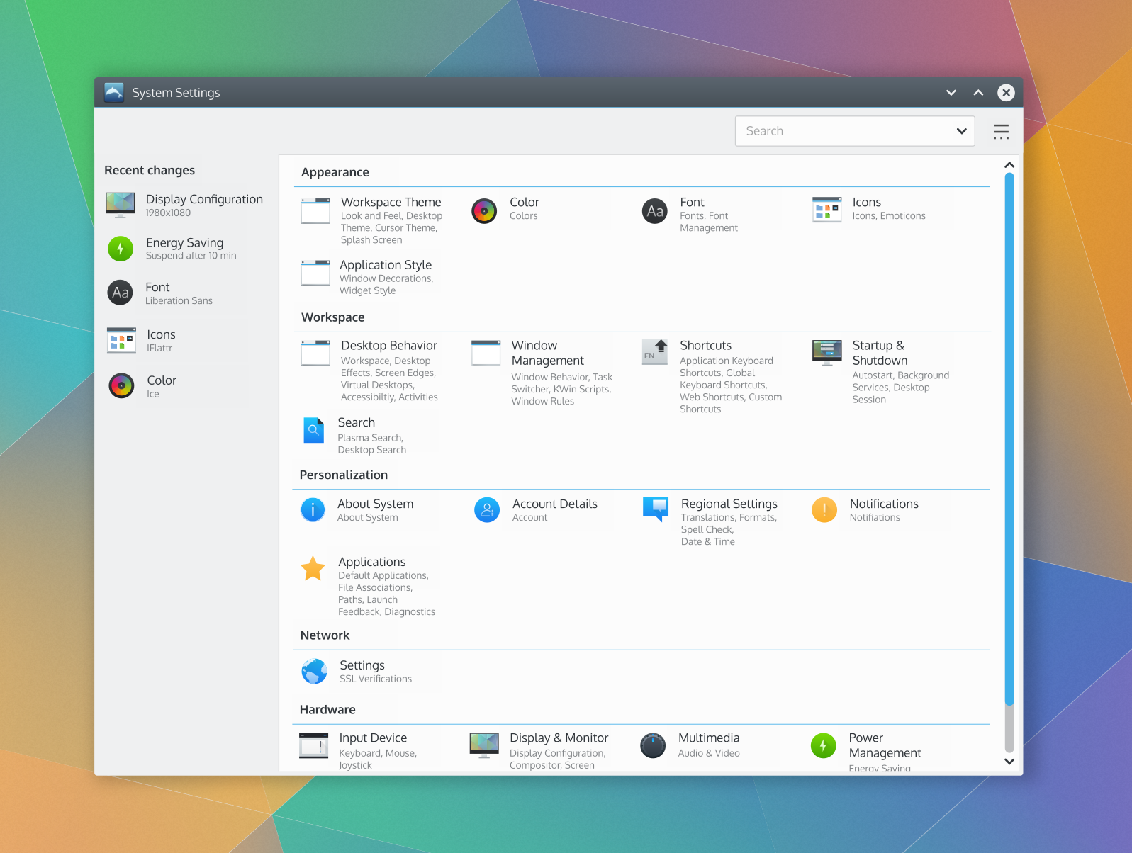
The navigation pattern chosen is a list+grid pattern to reveal the first two levels of the content structure, similar to the current system settings design. This is common with system settings applications across several platforms and may work well because it gives the user is given significant insight into the module hierarchy right away without requiring an interaction cycle. It also has the benefit of being a very recognizable pattern. As of this writing this pattern is not explicitly listed in the HIG, but it might be worth adding.
Layout Design
The VDG forum thread discussing the layout design is here: https://forum.kde.org/viewtopic.php?f=285&t=124463
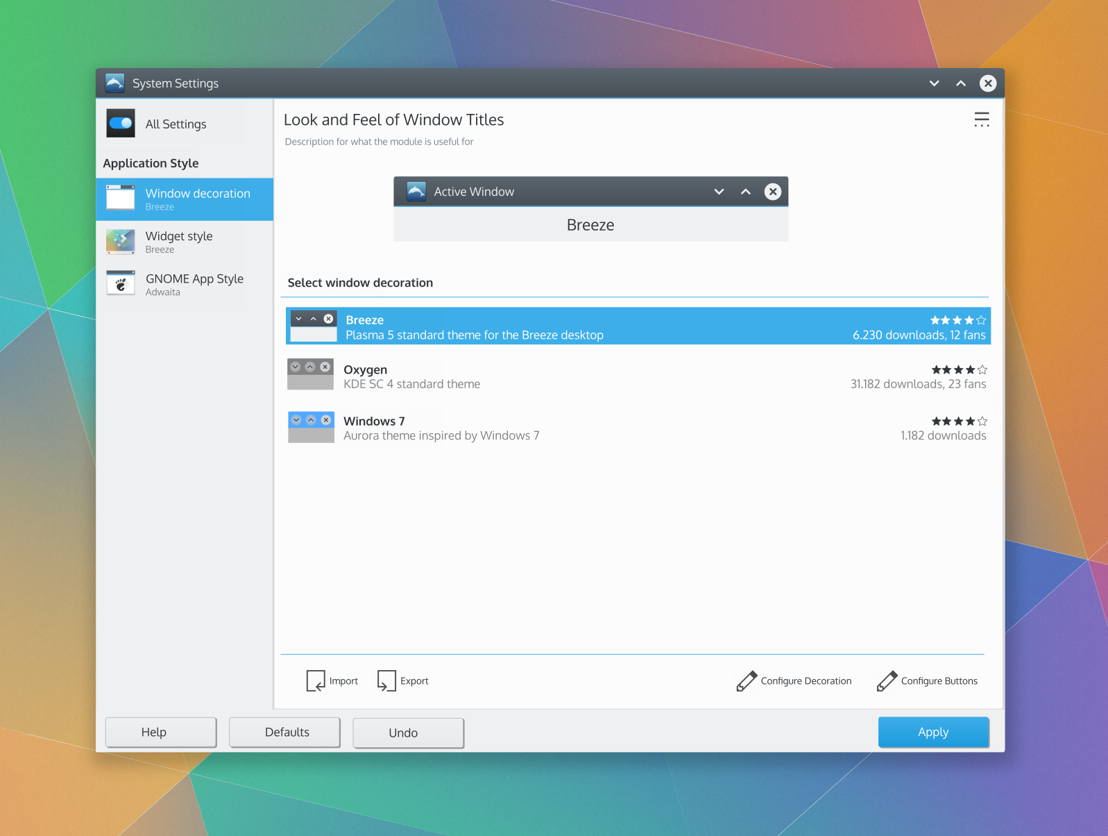
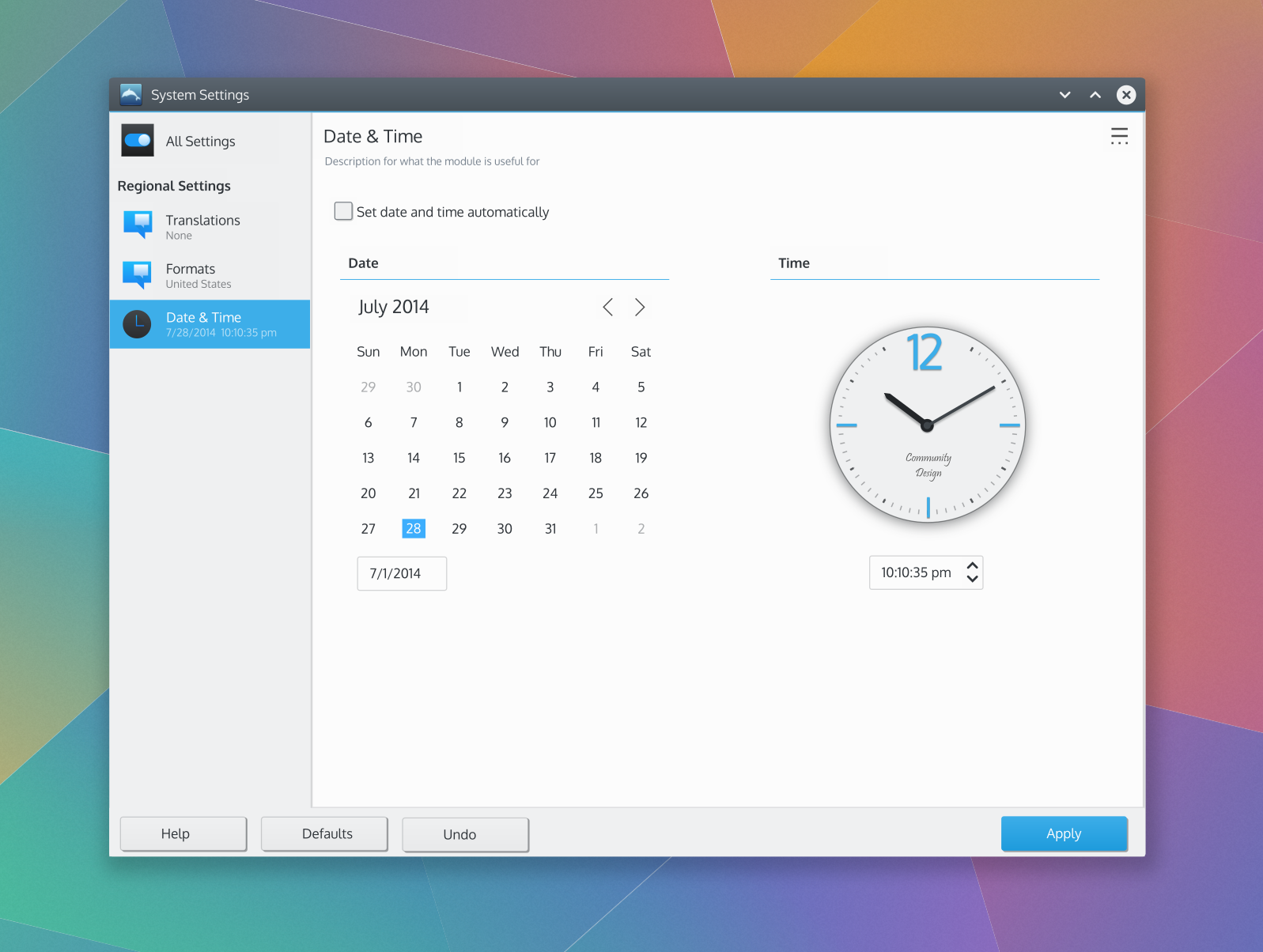
The basic design mockups are below:
Note that the design of the modules in the mockups is NOT important for this exercise. The focus here is the system settings application, not the module designs.


