KDE Visual Design Group/Muon Discover: Difference between revisions
| Line 42: | Line 42: | ||
* Application Name | * Application Name | ||
* Category | * Category | ||
* Version | * Installed Version | ||
* Available Version | |||
* Release date | * Release date | ||
* Screenshots/Video | * Screenshots/Video | ||
Revision as of 18:34, 10 November 2014
Concept
See KDE HIG for guidelines on this design approach.
Muon Discover Vision
Haven’t you ever found a tool that was perfect for your need but you only found it after some time stumbling upon it on the net? When considering to install an application, don’t you wonder sometimes if it’s really worth it? Or if it’s actually what you’re looking for?
Muon Discover helps users easily and quickly find applications or tools. By allowing to navigate a software library by search, software categories, top 5 lists along with detailed application information that includes screenshots and reviews, users can more quickly find applications that suit their needs.
Furthermore, Muon Discover will let you manage the different sources of software you have and manage the applications you’ve already installed in the past but you don’t want anymore.
Personas
(Selected from the pre-defined KDE personas)
- Susan, 34, Recreational user. While Susan seldom uses her computer for work, it has become an essential part of her social life. With her computer, she can be creative and spread this creativity in the world. She chats with her friends, shares music, playlists and other media, creates videos and uploads them to her web space, and runs a blog with her own style. She can't imagine a life without her laptop. Still, she is a fun person and does not want to worry about technical details. She expects her machine to work.
- Santiago, 34, Decision Maker. Santiago runs a medium-sized business for electric installations. For him, technology needs to be comfortable and make him feel smart. As a manager with engineering background, Santiago's major work is to negotiate with customers. However, to avoid costs, he administrates the small network in the company himself, including a file server and fifteen PCs for his office clerks. He loves comfort and does not like to dive into manuals or use the command line to set up the small network. The system has to be reliable and easy to use, so his employees get along with it.
Scenarios
- Susan would like to find a specific application she learned about in her art circle.
- Susan would like to find an application that let's her view an email attachment.
- Santiago would like to find and evaluate office document/spreadsheet editors that he will eventually deploy to the entire office.
- Susan would like to find a highly-rated raster image editor to tweak pictures for her blog.
- Santiago is doing a yearly clean up of his computer and would like to remove applications he is no longer using.
- Santiago would like to install Google Chrome from Google app repo so he can get regular updates seamlessly.
- Susan would like to find some fresh icons to brighten up her computer workspace.
- Santiago would like to make it easy for his employees to install critical system updates.
Organization
Command Structure
The essential commands are:
- Install one or more applications
- Remove one or more applications
- Install system or application updates - most frequently used
- Add/Edit/Remove software repositories - least frequently used
This meets the criteria for a simple command structure.
Content Structure
There are two collections of content: the software library and the collection of software repositories.
Software Library
- Application Name
- Category
- Installed Version
- Available Version
- Release date
- Screenshots/Video
- Reviews
- Review Version
- Rating
- Review text
Applications can be grouped by category. When grouped, the software library content structure is 3-deep.
Software repository collection
- Name
- Repository url
- Category
- Target OS version
- Source/Binary
- Enabled/Disabled
Software repositories can be grouped by category. When grouped, the software repositories are 2-deep.
UI Patterns
- Command pattern for a simple command structure: Direct manipulation of content. No menu buttons, context menu or context panel.
- Navigation pattern for a flat content structure: Wizard. The layout used is slightly different than shown in the HIG, but should, noentheless, satisfy the underlying intent of each of the wizard pattern guidelines. (There are also potential issues with the HIG layout that might be worth revisiting).
Layout Design
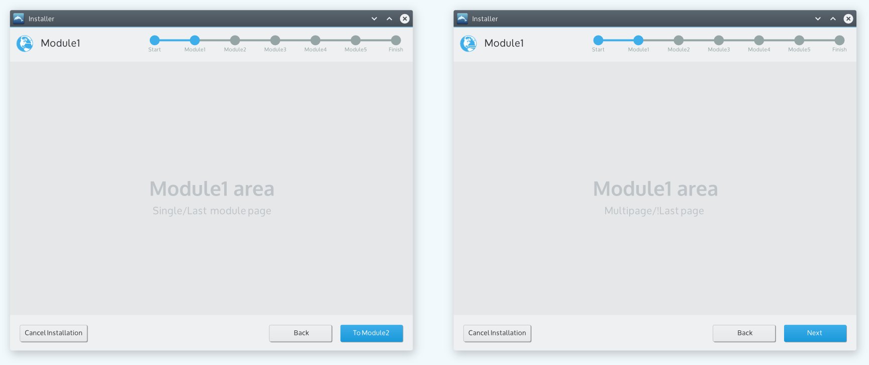
 When the next step transitions to another module the "next" button shows the name of the next module. Otherwise when the next step is just another page within the existing module the "next" button just shows "Next". So the first image shows the layout for a single page module or the last page of a multipage module and the second image shows the layout for a page that's not the last page in a multipage module.
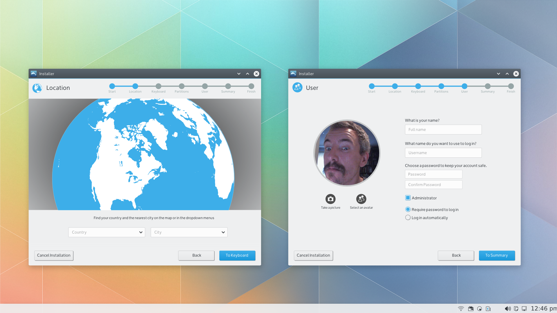
Applying to a couple of example modules, it might look like this:

Implementation Targets
- For the November 2014 project milestones, perhaps just the "container" design (top and bottom panels) can be implemented.
- The detailed module designs could perhaps be implemented as part of the longer term project goals.
