KDE Visual Design Group/KirigamiHIG/NavigationPatterns/Grid: Difference between revisions
(Started article.) |
No edit summary |
||
| Line 1: | Line 1: | ||
= Grid = | = Grid = | ||
[[File:Kirigami-grid-vs-list.png]] | |||
== When to use == | == When to use == | ||
Latest revision as of 14:43, 3 August 2017
Grid
When to use
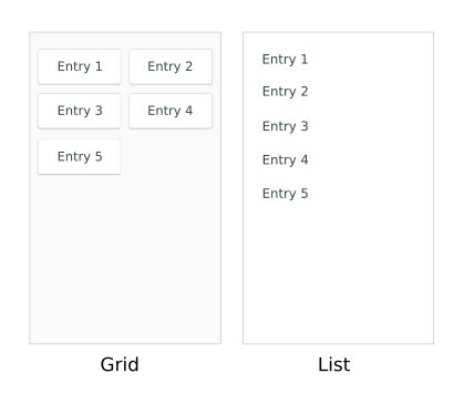
Use a grid to show a set of elements which can best be represented graphically (as images with or without text), such as a gallery of pictures or video thumbnails, or the content of a store.
For elements that are better represented by text, use a List.
How to use
- Make sure that the list items are big enough and there is enough padding between them for users to easily tap items
- Accompany images with a textual label if there is a chance that certain elements may be easier to recognize by their text than their graphical representation
- If a grid is populated from an online source, use the "Pull to refresh" feature that allows users to update it simply by pulling it down beyond the first (i.e. newest) grid item
Implementation
- Use a GridView within a Page or ScrollablePage (if the grid can contain more elements than fit on the screen) to implement this pattern
- Set supportsRefreshing: true on the ScrollablePage to allow "Pull to refresh"

