KDE Visual Design Group/Unified Login: Difference between revisions
| (17 intermediate revisions by 5 users not shown) | |||
| Line 1: | Line 1: | ||
==Concept== | ==Concept== | ||
The current situation with login is one where the previous attempts at unifying the experience fell short and parts become too complex to properly implement. So this work was restarted with mockups from Andreas Kainz, Alex L, Andrea | The current situation with login is one where the previous attempts at unifying the experience fell short and parts become too complex to properly implement. So this work was restarted with mockups from Andreas Kainz, Alex L, Andrea dS and others with the intention of creating one single, simple, unified experience of login from eventual Grub menu, via Plymouth, SDDM login screen, Ksplash and Plasma Desktop. | ||
As KDE gets a new web presence, visual style presence and communication form a unified login experience will be part of that. | As KDE gets a new web presence, visual style presence and communication form a unified login experience will be part of that. | ||
| Line 44: | Line 44: | ||
*[https://techbase.kde.org/Projects/Usability/HIG/Patterns/CommandPatterns#Patterns_for_a_simple_command_structure Command pattern for a simple command structure]: '''Direct manipulation of content'''. No menu buttons, context menu or context panel. | *[https://techbase.kde.org/Projects/Usability/HIG/Patterns/CommandPatterns#Patterns_for_a_simple_command_structure Command pattern for a simple command structure]: '''Direct manipulation of content'''. No menu buttons, context menu or context panel. | ||
==Layout Design== | ==Layout Design== | ||
===Grub Theme=== | |||
[[File:grub-theme.png]] | |||
===LoginScreen=== | |||
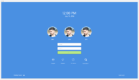
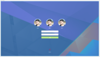
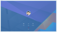
Current design of the login screen: | |||
[[File:LoginScreen.png | 200px]] | |||
[[File:DefaultWallpaper_AvatarWithBorders.png| 200px]] | |||
[[File:RemoteLogin.png| 200px]] | |||
Structure: | |||
[[File:Blueprint.png| 200px]] | |||
[[File:BlueprintBottom.png | 200px]] | |||
Revised Design 2016, summer. | |||
The example of Plymouth is not ment as an idea to reuse the neon logo in all distros but under the assumption that distros will place their own logo there. For SDDM theme the ideal is that the user clicked will have his or her name prefilled in "user". Same as with Plymouth the animation and icon are not tied to all but replaced with distro logo and name as needed. Wallpaper in last two screenshots is the same as set by user. | |||
[[File:Grub mockup.png| 200px]] | |||
[[File:Plymouth_mockup.png| 200px]] | |||
[[File:SDDM_mockup.png| 200px]] | |||
[[File:Ksplash_mockup.png| 200px]] | |||
[[File:Switchuser_mockup.png| 200px]] | |||
[[File:Logoutrestart_mockup.png| 200px]] | |||
Login Transition: | |||
[https://share.kde.org/index.php/s/xxVtPVAEllFaTLd Transition from login screen to loading sequence ] | |||
Login and user swith animation | |||
https://www.dropbox.com/s/5qi9hioh2u9ngrb/LoginAnimationUpdated.mov?dl=0 | |||
==Implementation Targets== | ==Implementation Targets== | ||
== Technical Notes == | |||
=== Grub === | |||
* We cannot use actual windows nor mac os x logos for legal reasons (proprietary trademarks) | |||
* Presently grub theming is very very limited | |||
** OS list is always a vertical list of possible entries. to the left of the entries there can be an operating system icon (if available). we can place the list where we want. we can give it a scrollbar if we want. we can theme the rectangles of the list, all entries in the list and the scrollbar. | |||
** Highlighted entries need to be considered for the OS list | |||
** There can be a timeout progress_bar for when the automatically selection will boot if the user does nothing. this is also a box we can theme. the box can contain text if desired. by default the text is something along the line of "the highlighted entry will be executed automatically in 6s" | |||
** The proress_bar can also be circular | |||
** Font rendering is very subpar, so terminal/mono fonts usually work better than serif or sans fonts | |||
* There can be a resolution switch between grub and plymouth so progressbars should be consistently at the top or the bottom if the progress bar also should appear in the plymouth theme. otherwise it will visually jump around | |||
* In between OS selection and plymouth showing up there will be a black grub terminal rendered in the middle of the screen using approximately 50% of the available screen estate. There doesn't seem to be conclusive information on whether or not this can actually be hidden. | |||
=== Plymouth === | |||
* Three possible theme modes depending on how shitty the drivers are (32bit, 16bit, 8bit). we cannot control which is used so a design at its heart should work for all three. | |||
** 32bit: can do a lot of the things we can do in qml. we can use transparency and all of the rainbow colors. also animations (albeit more work to get right). simple gradients on the background are also possible. | |||
** 16bit: same as 32bit but limited colors. no gradients and all that. | |||
** 8bit: basically can only do drawing we could do on a terminal. colors are super limited. this is also the hardest mode to code, so the simpler the better. | |||
* No background wallpapers, because we cannot put multiple resolutions into the theme without increasing boot time. a fixed color background with possible gradient for 32bit mode is suggested. | |||
* At least in 32bit and 16bit mode we can paint images (with color space limitations in the case of latter) | |||
* All artwork needs to be available 2x as big for hidpi (e.g. logo). this is not really figured out. hidpi seems an on-going challenge with plymouth | |||
* Progressbar should be infinite. as accurately reporting progress is nigh impossible at this stage. e.g. a spinning indicator or an endless repeating bar would work | |||
* Plymouth can also have status notifications and passwords which ought to be considered | |||
* Plymouth can only render PNG images | |||
Latest revision as of 10:43, 21 July 2016
Concept
The current situation with login is one where the previous attempts at unifying the experience fell short and parts become too complex to properly implement. So this work was restarted with mockups from Andreas Kainz, Alex L, Andrea dS and others with the intention of creating one single, simple, unified experience of login from eventual Grub menu, via Plymouth, SDDM login screen, Ksplash and Plasma Desktop.
As KDE gets a new web presence, visual style presence and communication form a unified login experience will be part of that.
Login Vision
Unified Login as a project is intended for computer users who expect that their computer is working as a unified whole instead of different interconnected but isolated parts. Visually it will provide the user with a sense of continuation while still not hiding eventual grub menu, plymouth splash or other details from those more technically adept who may need it.
The ideal scenario is that a user should assume that KDE and Plasma are part of every step in the boot process and be confirmed of that visually during the entire experience.
Personas
(Selected from the pre-defined KDE personas)
- Primary Persona - Susan, 34, recreational user. Susan wants to login to her computer and assume that every part of her computer is part of a larger whole. She wants to feel certain that from the second her computer is turned on her experience and work are all handled by the same system.
- Secondary Persona - Philip, 17, geek. Philip wants to access grub settings and set different kernel boot parameters, he also wants to swap between different users simply. His focus is not as much of the experience of one whole system, but the accessibility of features he feel that he needs.
Scenario
Susan wants to boot her computer and see that it is working and know what to expect of the different aspects. She intends to login, writing in her password and be aware that the computer hasn't crashed or hung during boot. She is happy that her computer visually is similar in all aspects, assuming that the OS she installed is in full control and that there are no empty "hacky" areas. Philip wants to access Grub and add kernel boot parameters to test different ones and how they impact his computers behaviour.
- Main Task - Booting the computer, ensuring a clean boot that displays the state of the boot process.
- Sub-Task - making sure that alternative usage, with access to settings during boot isn't hidden away entirely yet not pressed in the face of users who would not benefit from them.
Organization
Command Structure
Content Structure
The essential commands are:
- Note which option you prefer in the Grub Menu (if Visible)
- Select your preferred option if applicable
- Press enter to select or wait for timer to end
- Access Grub Settings using shortcut or choosing option
- Access Command Line
- Wait for Plymouth to Finish
- Note that your user is pre-chosen in SDDM
- Pick user in SDDM
- Select SDDM language
- Select preferred desktop environment in SDDM
- Type in your password (as the password field should be autofocused) and hit enter or press "Login"
- Note that Ksplash is working and the desktop is loading
- Note that you've reached the Desktop Environment
UI Patterns
- Command pattern for a simple command structure: Direct manipulation of content. No menu buttons, context menu or context panel.
Layout Design
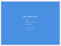
Grub Theme
LoginScreen
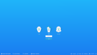
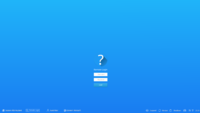
Current design of the login screen:
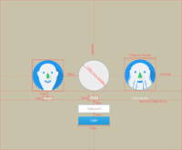
Structure:
Revised Design 2016, summer. The example of Plymouth is not ment as an idea to reuse the neon logo in all distros but under the assumption that distros will place their own logo there. For SDDM theme the ideal is that the user clicked will have his or her name prefilled in "user". Same as with Plymouth the animation and icon are not tied to all but replaced with distro logo and name as needed. Wallpaper in last two screenshots is the same as set by user.
Login Transition:
Transition from login screen to loading sequence
Login and user swith animation https://www.dropbox.com/s/5qi9hioh2u9ngrb/LoginAnimationUpdated.mov?dl=0
Implementation Targets
Technical Notes
Grub
- We cannot use actual windows nor mac os x logos for legal reasons (proprietary trademarks)
- Presently grub theming is very very limited
- OS list is always a vertical list of possible entries. to the left of the entries there can be an operating system icon (if available). we can place the list where we want. we can give it a scrollbar if we want. we can theme the rectangles of the list, all entries in the list and the scrollbar.
- Highlighted entries need to be considered for the OS list
- There can be a timeout progress_bar for when the automatically selection will boot if the user does nothing. this is also a box we can theme. the box can contain text if desired. by default the text is something along the line of "the highlighted entry will be executed automatically in 6s"
- The proress_bar can also be circular
- Font rendering is very subpar, so terminal/mono fonts usually work better than serif or sans fonts
- There can be a resolution switch between grub and plymouth so progressbars should be consistently at the top or the bottom if the progress bar also should appear in the plymouth theme. otherwise it will visually jump around
- In between OS selection and plymouth showing up there will be a black grub terminal rendered in the middle of the screen using approximately 50% of the available screen estate. There doesn't seem to be conclusive information on whether or not this can actually be hidden.
Plymouth
- Three possible theme modes depending on how shitty the drivers are (32bit, 16bit, 8bit). we cannot control which is used so a design at its heart should work for all three.
- 32bit: can do a lot of the things we can do in qml. we can use transparency and all of the rainbow colors. also animations (albeit more work to get right). simple gradients on the background are also possible.
- 16bit: same as 32bit but limited colors. no gradients and all that.
- 8bit: basically can only do drawing we could do on a terminal. colors are super limited. this is also the hardest mode to code, so the simpler the better.
- No background wallpapers, because we cannot put multiple resolutions into the theme without increasing boot time. a fixed color background with possible gradient for 32bit mode is suggested.
- At least in 32bit and 16bit mode we can paint images (with color space limitations in the case of latter)
- All artwork needs to be available 2x as big for hidpi (e.g. logo). this is not really figured out. hidpi seems an on-going challenge with plymouth
- Progressbar should be infinite. as accurately reporting progress is nigh impossible at this stage. e.g. a spinning indicator or an endless repeating bar would work
- Plymouth can also have status notifications and passwords which ought to be considered
- Plymouth can only render PNG images

